Despite the unemployment rate being at 4.8%, the stock market hitting record highs, and other positive economic indicators in recent weeks, I want to shine a light on those areas of the U.S. where the recovery hasn’t been fully realized. This is an important point to be made because there is such a disconnect between life on the coast and in big cities compared to the rest of America. I don’t mean a disconnect in terms of culture, as most Americans are far more alike than recent political battles would have you believe, but a disconnect in terms of economic changes since the recession.
This is significant because the economy was a key reason why many Democratic counties in 2012 went Republican in 2016. Even Mark Zuckerberg will be traveling to all 50 states in 2017 to”get out and talk to more people about how they’re living, working and thinking about the future.” The point is that you can’t just look at the average effect when you are measuring something: the distribution matters too. There is the story about the man who drowned in a lake with an average depth of 1 foot because of the huge sink hole in the middle surrounded by 6 inches of water elsewhere. The flaw of averages is real and I will explore this geographically with data from the Bureau of Labor Statistics.
Quick side note: I have finally figured out how to make GIFs in R (hint: use the “magick” package or steal my code here). For your viewing pleasure let’s start with the unemployment rate by county from 2007 to 2015 (darker red = higher unemployment). Note: White counties are missing data and the loop repeats indefinitely. Start paying attention when it gets to 2007 for the best visual effect over time:
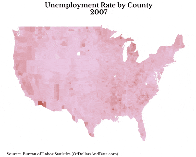
By 2015 there had been quite a recovery based on the unemployment rate across most of the country. However, the unemployment rate can be biased because how it is calculated. The formula for the unemployment rate is:
unemployment rate = # unemployed / (# employed + # unemployed)
If an individual leaves the labor force (i.e. they are no longer looking for a job), they are removed from both the numerator and denominator, so the unemployment rate would drop. This is why we need to look at the labor force (or employed + unemployed) as well. While on aggregate, the labor force has increased since 2007, this is the average affect. If we look across the country we see a different picture of what’s happening in the job market. The map below shows the decrease in the labor force (by county) from 2007 to another year (i.e. 2008, 2009, etc.). In this case darker red = a larger decrease in the labor force:
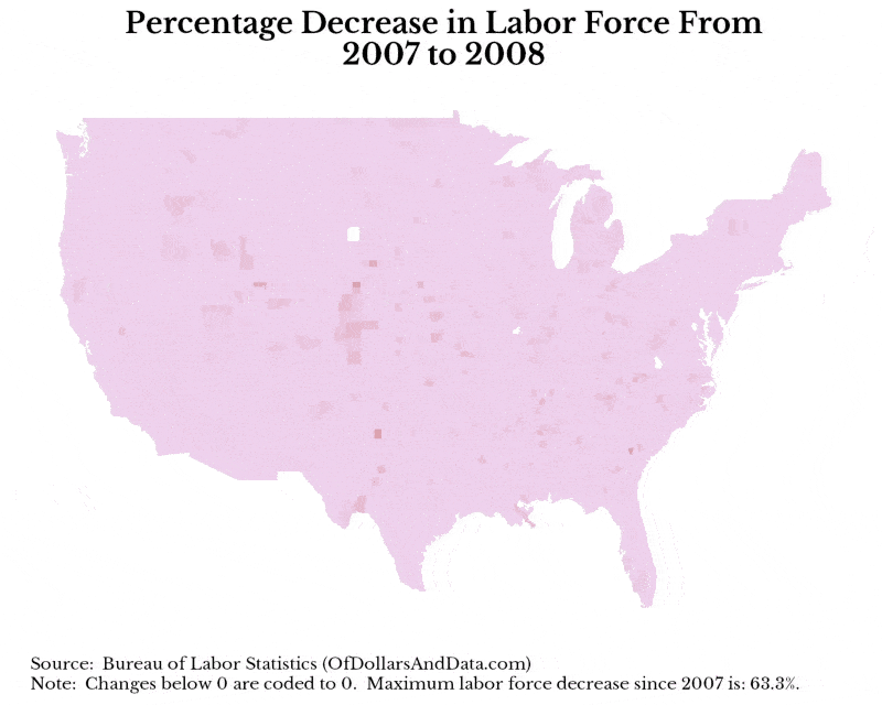
Now just because we see a declining labor force in many counties, this is not completely a bad thing. For example, many of these people could have moved to another county to get a job. However, a more telling guide that people are not just moving to different counties is the falling labor force participation rate. Labor force participation has decreased 3% since 2007, which means 3% fewer Americans (relative to the working age population size) are looking for jobs, or are employed today, than in 2007. This is telling evidence that some people have quit looking. To get a more aggregated picture of this, below is the percentage decrease in the labor force at the state level from 2007 to 2015:
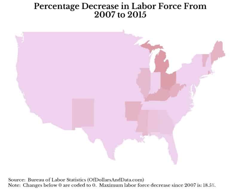
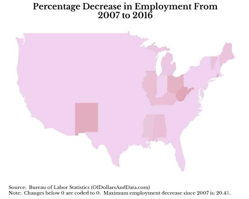
As you can see the states most affected by a lowered labor force are in the midwest and the south. The coasts have been mostly spared of this decrease in the labor force. If we look at the changes in total employment over this same time period, we see a similar story:
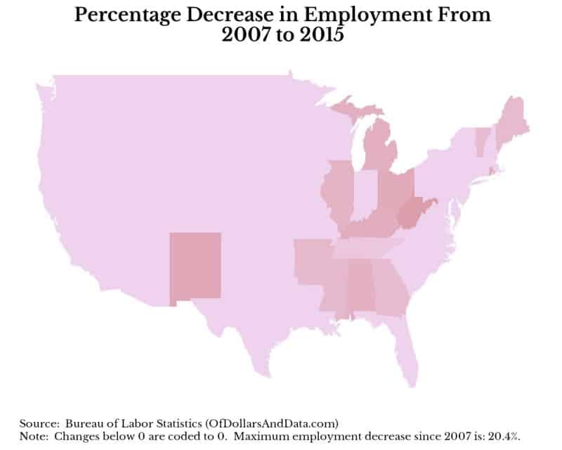
It seems clear to me that the those states with lower employment levels since 2007 are highly correlated with the states with a decreased labor force. This is the economic divide between the coasts and middle America that does not seem to be widely discussed by the media. The good news is that the situation has improved even within the last year. I don’t have the 2016 statewide average data yet, but I averaged the monthly 2016 data and the outcome looks somewhat better:
How to Heal the Scars: A “Reprogramming” of the Labor Market
The situation we see today in middle America is likely one of structural unemployment (i.e. unemployment due to changes in industry). As more manufacturing jobs have moved outside of the U.S. and the rise of technology has come to dominate our economy, middle America did not see the same benefits as the coasts did. How can this be changed? I suggest a “reprogramming” of the labor market to focus on more education aimed at the jobs of today and tomorrow (i.e. computer science/programming). This WSJ article highlights this idea by discussing coding bootcamps as a jobs program.
Despite the hurdles involved with this idea, I am optimistic that more programming education will help the labor market. Currently the demand for programming jobs exceeds supply and the Bureau of Labor Statistics projects that there will be 1,000,000 unfilled jobs in this area by 2020. Though this country has many scars from the Great Recession, it does not need to stay that way. Thank you for reading!
If you liked this post, consider signing up for my newsletter.
This is post 12. Any code I have related to this post can be found here with the same numbering: https://github.com/nmaggiulli/of-dollars-and-data