


After seven straight weeks of losses, the S&P 500 posted a weekly gain of 6.6% through last Friday’s close. The good news is that the market pain we’ve been experiencing might be over. As Bret Kenwell recently stated:
Each downtrend of this magnitude (seven straight weeks or more) has marked the low for at least six months.
The bad news is that Kenwell only has four data points to go on. Though we may have hit a temporary bottom, there’s nothing stopping things from going even lower in the future. In other words, last week’s gain may be the beginning of a false rally.
To this end, I thought it would be useful to exam how the U.S. stock market has bottomed historically and the false rallies that have occurred along the way.
The Biggest U.S. Market Bottoms
In the realm of U.S. stock market history there are four major bottoms that come to mind—1932, 1974, 2003, and 2009. While all of these bottoms are unique in their own way, they each had at least three rallies of 10% or more on the way down.
For example, the crash that started The Great Depression had six separate rallies of over 10% before hitting bottom in July 1932. I’ve illustrated these rallies in the chart below by denoting the local bottoms (in red) followed by their local tops (in green) along with how much the marked gained between the two (in percentage terms):
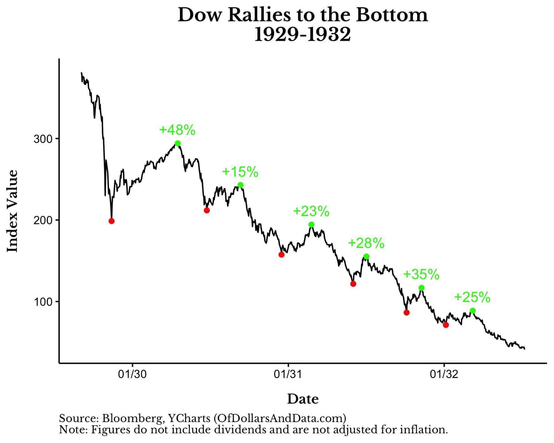
If there’s one chart that illustrates the difficulty of investing in stocks, this is it. As you can see, even as the U.S. stock market was collapsing, there were multiple periods where it rallied over 20% before continuing to fall further. Just imagine how maddening this must have been for everyone, even the most seasoned investors.
Of course, not all crashes are this brutal. The crash of 1974 was more tame because it was both slower and less severe than the Great Depression. Nevertheless, by the time the market bottomed in December 1974, it had rallied by over 10% on three separate occasions:
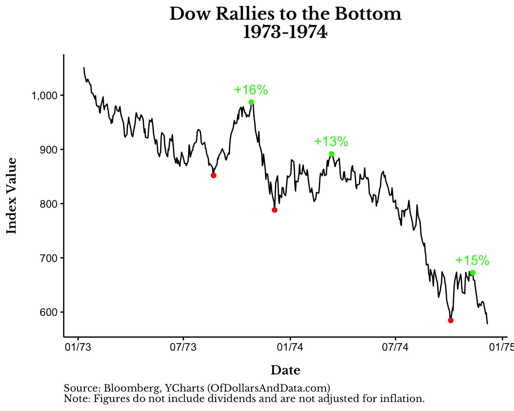
Not only was this decline slower than the one that started The Great Depression, but most of the decline occurred in the six months right before the bottom.
Similar to the crash of 1974, the crash of 2000-2003 also experienced a slower initial decline (trading sideways for about 18 months) before the market started to come undone in 2001:
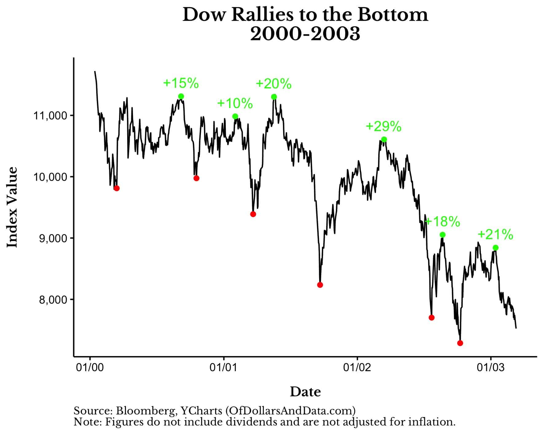
However, unlike the crash of 1974, this market experienced six separate rallies exceeding 10%! These rallies came amidst the implosion of the DotCom Bubble and following the attacks on September 11th. This illustrates just how easily false hope can build up during the toughest of times.
Last but not least, the crash of 2008-2009 is unlike any of the other crashes listed above. Why? Because it was mostly a downward journey and it occurred much more quickly than the other market crashes. As a result, it had fewer rallies and saw most of its decline occur in the span of five months from October 2008 to March 2009:
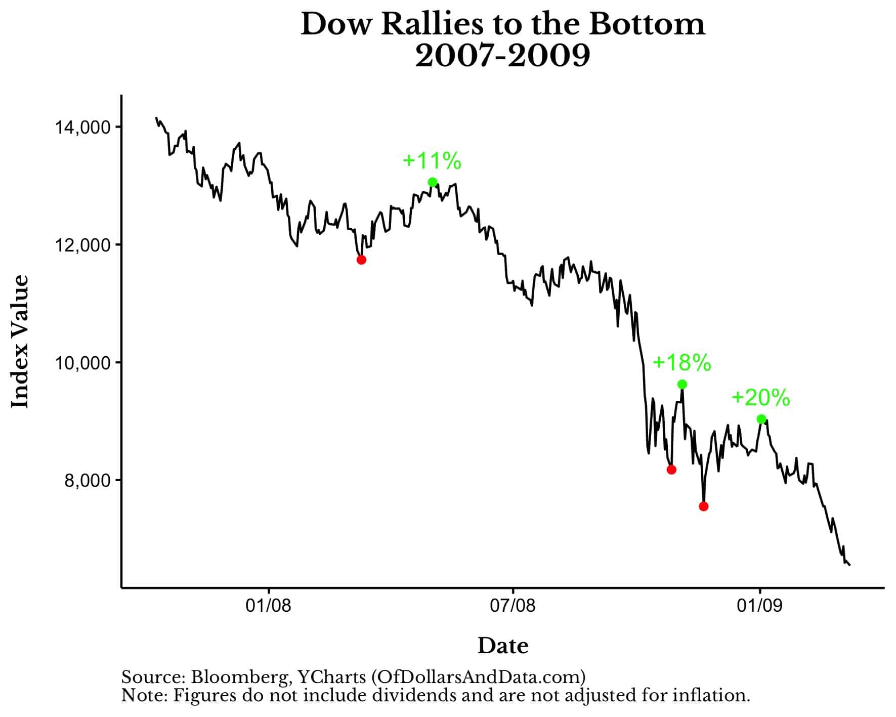
Not surprisingly, this five month window also coincides with the two biggest rallies during this time period. This makes sense because, as market history has shown us, volatility begets volatility. This means volatility to the downside and the upside. As William Bernstein stated in this discussion with Ben Carlson:
One thing that we learned from market crisis whether it’s the early 1930s or the more recent global financial crisis is that big up days, 6%, 8%, or 10% up days (like in 2008 or 2009) that’s volatility. And volatility is volatility, and it’s bad.
This is why market rallies aren’t always a positive sign. Because, sometimes, these rallies are a warning of what’s to come.
The Bottom Line
Though last week’s 6.6% gain may have you feeling some relief, it’s too soon to tell if we are out of the woods yet. Unfortunately, one week isn’t enough time to differentiate a false rally from a true recovery. In fact, of the 18 rallies I highlighted across the four market crashes listed above, the average length of the typical rally was two to three months. So, regardless of what’s to come, last week was just the beginning.
I don’t say this to scare you, but to provide you with a realistic understanding of how markets work. That’s how you become a better investor. You recognize the nature of the market and invest accordingly. You don’t panic. You don’t change your strategy. You educate yourself and acknowledge volatility when it rears its ugly head. As I stated in Chapter 16 of Just Keep Buying:
You have to accept that volatility is just a part of the game. It comes with the territory of being an investor.
This doesn’t mean that you have to be happy when markets decline. Trust me, I do not enjoy seeing stocks fall. But, I also don’t lose my head either. Instead, I see these occasional declines for what they are—risk.
And nothing good in life comes without risk. Not love. Not a career. Not a family. Nothing. So why should money? Why should your wealth magically compound itself at 7% a year? It shouldn’t. At least not in a straight line.
It should be a windy, windy road to get there. And that’s okay. That’s what you should expect to happen. The volatility of today should pay for the growth of tomorrow. Not in every market every time, but in most markets most of the time. That’s what matters. That’s what the data suggests.
Of course it’s easy to talk about this in a vacuum. It’s easy to point at charts of years past and say “Buy and hold”, but it’s much harder to “Buy and hold” while living through them. Then again, maybe that’s what separates the good investors from the great ones. Unfortunately, there’s only one way for you to find out.
Happy investing and thank you for reading!
If you liked this post, consider signing up for my newsletter.
This is post 297. Any code I have related to this post can be found here with the same numbering: https://github.com/nmaggiulli/of-dollars-and-data