


As you have already heard, coronavirus is sweeping the globe. With 1,018 confirmed deaths and over 43,000 reported cases across 28 countries (as of this writing), this illness has caused an international panic.
Things have gotten so bad that thousands of flights have been cancelled within China, the U.S. State Department issued a “Do not travel” advisory to the region, and one of the first doctors to sound the alarm on coronavirus recently passed away from it.
Because I am not an epidemiologist, I won’t opine on whether this level of panic is warranted. However, when there is a coronavirus-detecting robot roaming around Bryant Park in New York City, it’s hard not to notice.
Nevertheless, what I can do is discuss how coronavirus might affect your portfolio. Of course, we cannot know the future, but we can try to learn from the past. For example, if we look at how markets performed during prior epidemics, what do we see?
Yun Li at CNBC, recently wrote an article addressing this question, where she stated:
Looking back 20 years, previous epidemics from SARS in 2003 to the Ebola scare six years ago shaved 6% to 13% off the S&P 500 over different lengths of time, according to Citi.
Therefore, we should expect coronavirus to cause a market dip of 6% to 13%, right? Not so fast.
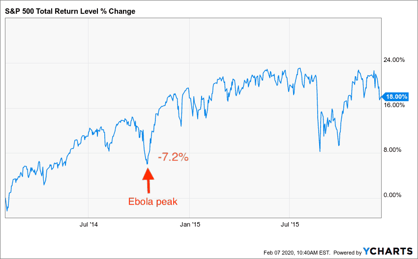
After digging more into the article, it seemed like the Citi study cherry-picked the time periods of each epidemic to conveniently fit their narrative. For example, they listed the end of the West Africa Ebola epidemic as February 2014, though the number of Ebola cases peaked 8 months later in October 2014:

This peak in Ebola cases does coincide with a 7% selloff in the S&P 500, but one that quickly corrected itself:
Additionally, the Citi study marked the end of the Zika epidemic at the same time as the early 2016 market selloff though the number of Zika cases continued increasing throughout the rest of 2016. I understand that it is very difficult to show causality between a real-world event and market movements, but, if you are going to do it, you have to be extremely careful when selecting which time periods to examine.
That is why this post will investigate an epidemic’s impact on the market by looking at the returns that occurred immediately before and immediately after that epidemic’s peak. Of course, this will never prove that the market reacted solely because of the epidemic, but it may provide a clearer picture than what prior analyses have shown.
Ebola
To start, let’s return to Ebola. Below is a chart of the total number of Ebola cases in West Africa over time, except the “Pre-Peak” period is colored red (to represents uncertainty/fear) and the “Post-Peak” period is colored green (to represents recovery):
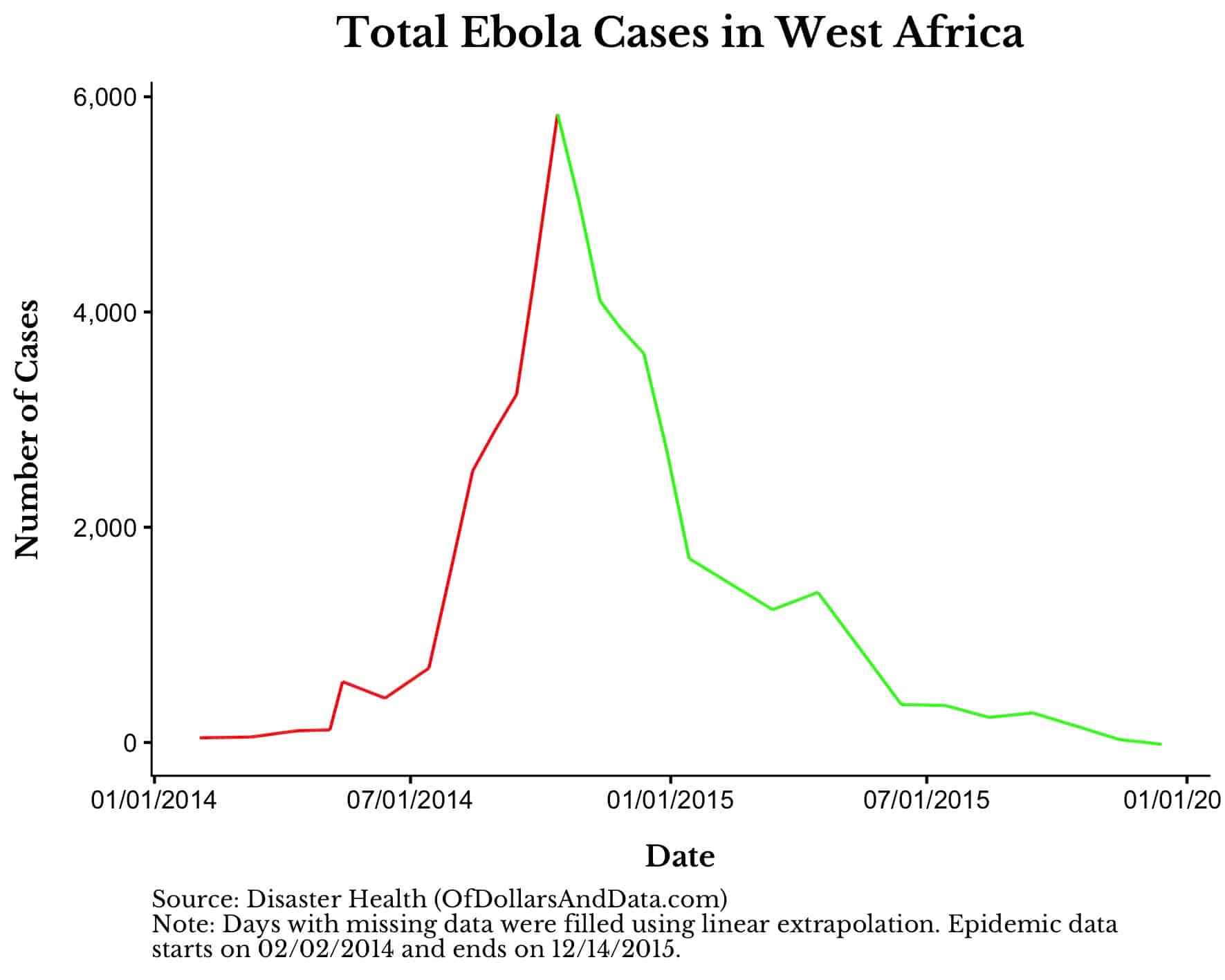
Of course, in real time no one would know that the peak was the peak (this is the privilege of knowledge), but let’s assume that people had some understanding that things were improving.
If we use this framework, we can then ask, how did returns look over the next week as Ebola was peaking and immediately after that peak. The following plot shows the S&P 500 against the number of Ebola cases (with the same pre and post-peak coloring):
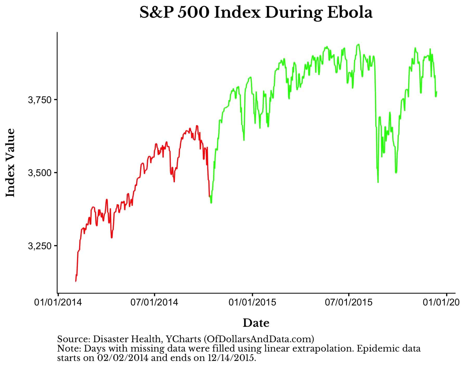
As mentioned earlier, markets dipped right before the Ebola peak, but then quickly reversed. In this instance, the market impact was only temporary.
SARS
We can use this same framework to ask how SARS affected global equity markets. This is a plot of worldwide SARS cases from the World Health Organization with the pre and post-peak coloring as mentioned previously:
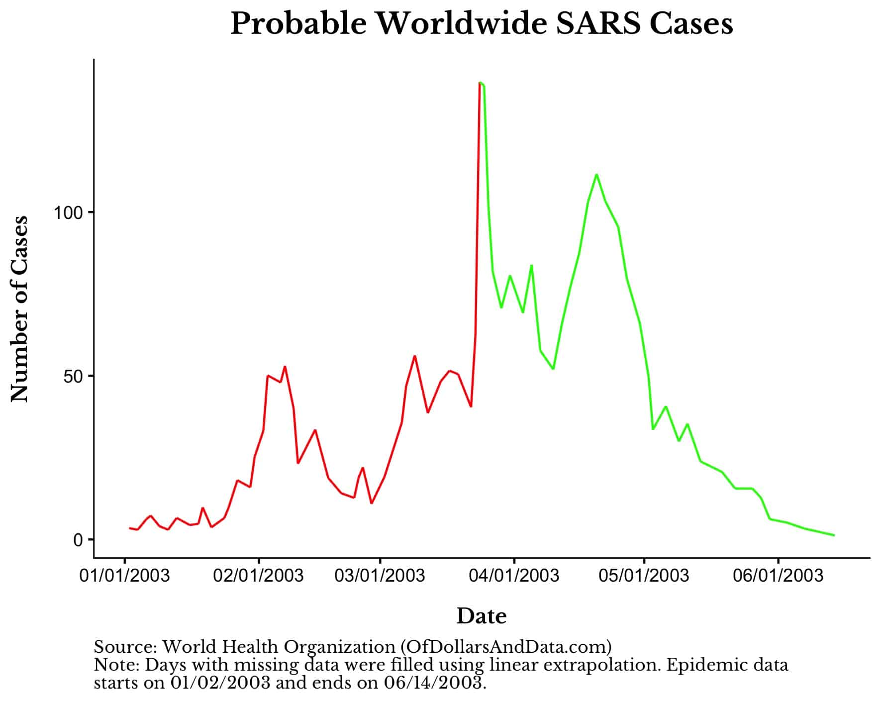
And once again we can ask how the S&P 500 performed as SARS peaked:
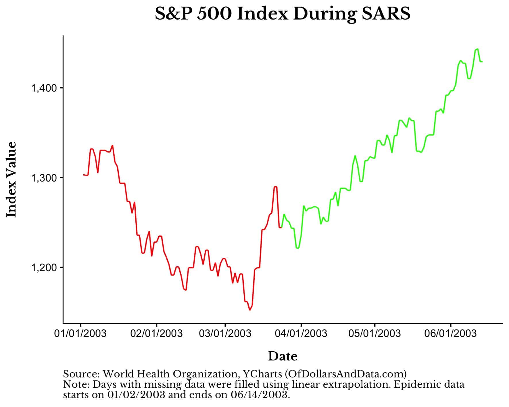
In this case, the early onset of SARS cases coincided with a 10% market decline over the course of 3 months. However, this decline started to reverse before SARS even finished peaking.
If you look the MSCI Emerging Markets (EM) index over this time period, you see a similar story:
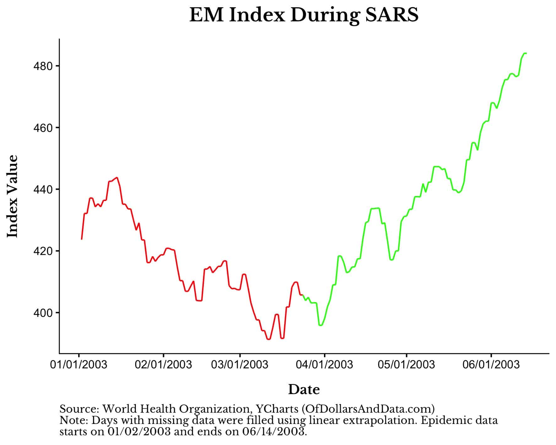
Like Ebola, the selloff in markets related to SARS were reversed in a short time period and recovery ensued.
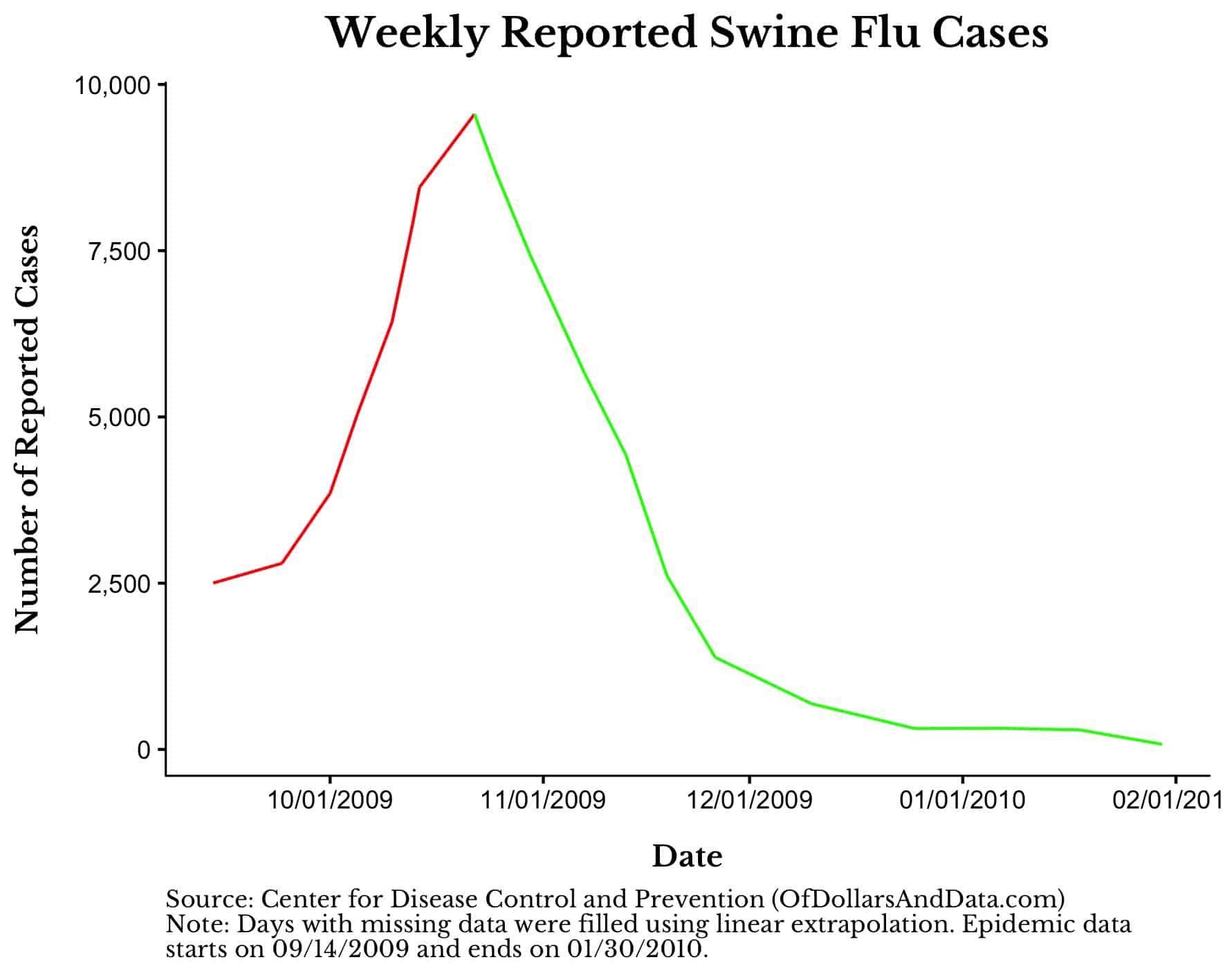
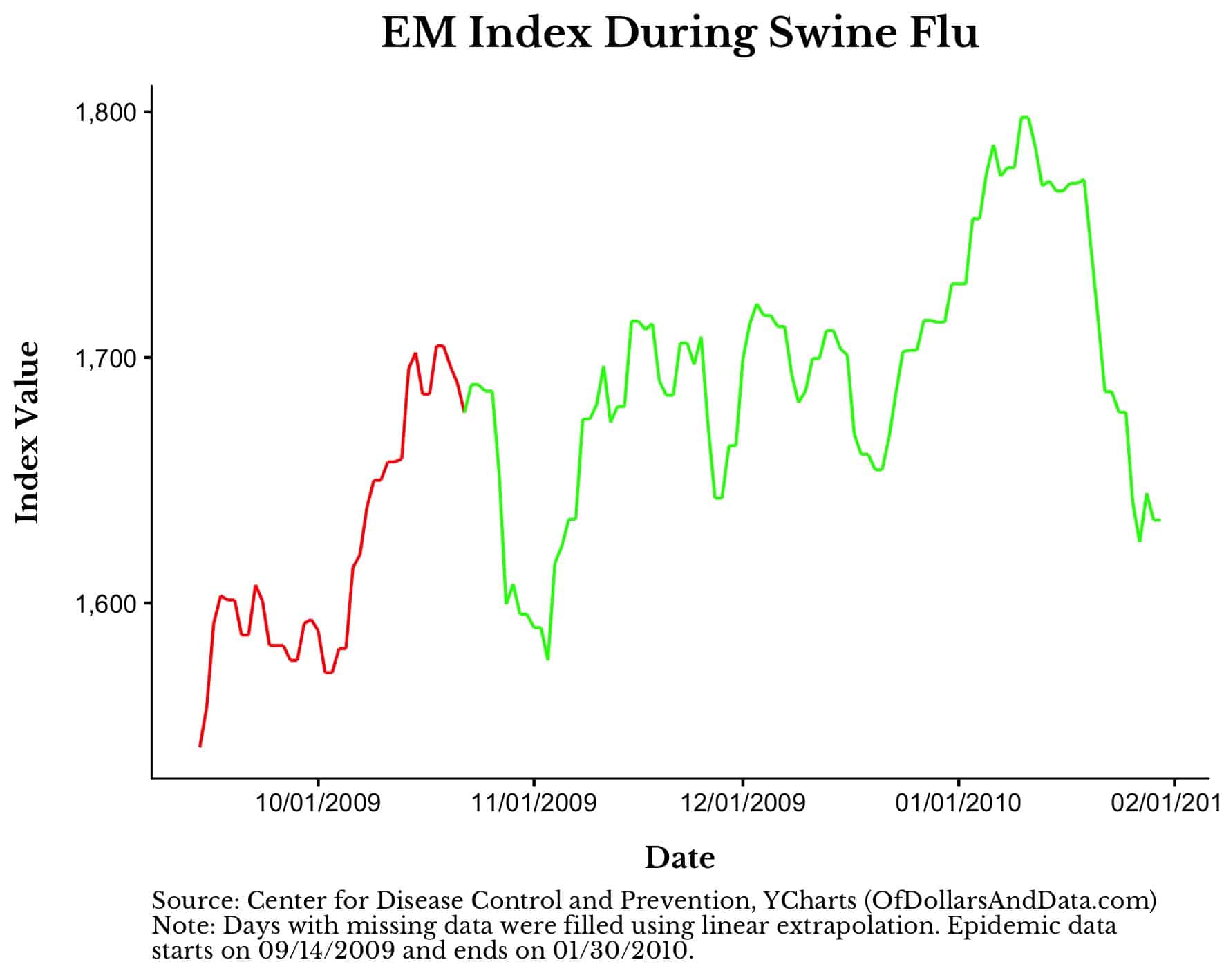
Swine Flu
The last modern epidemic we will examine is the 2009 swine flu:
Unfortunately, the relationship between swine flu’s peak and world equity markets is the weakest among the modern epidemics:
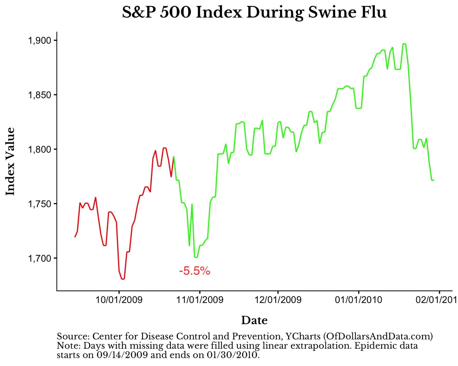
As you can see, there is a decline immediately after the peak in Swine flu cases, but that decline is the smallest we have seen so far, and, also, doesn’t last. Emerging markets reacted in a similar way (chart here).
In total, the three modern epidemics discussed (Ebola, SARS, and Swine flu) all coincided with minor declines in global equity markets (-5% to -10% range) that quickly recovered. Note that this is slightly smaller than the -6% to -13% cited in the Citi study quoted earlier despite me cherry-picking the local market tops/bottoms to try and match their narrative.
Any deviation from this cherry-picking strategy and the results are even less noteworthy. For example, Dow Jones Market data found that in 11 out of the 12 epidemics they studied, the S&P 500 was up 6 months after the first case was reported.
Therefore, if we assume that coronavirus will be similar in deadliness to Ebola, SARS, or Swine flu, then I wouldn’t worry about the long term impact on my portfolio.
But, I already know what you’re thinking. What if coronavirus ends up being worse than these modern epidemics?
One of the arguments for why markets crash during viral outbreaks is that market participants are anticipating worsening results. If coronavirus presented more of an existential crisis to humanity, wouldn’t markets have to fall further as a result?
Unfortunately, given the limited number of epidemics we have seen in modern times, we don’t have lots of data to go on. But, we do have one pandemic that fits the bill. Enter the Spanish Flu.
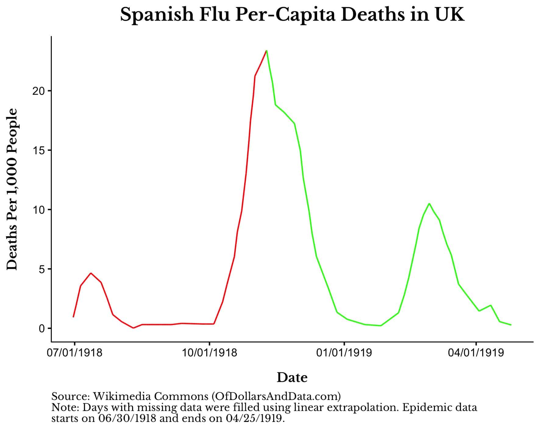
The Spanish Flu
Unlike the other epidemics on this list, the Spanish flu was a global killer. Between 1918 and 1920, it infected over 500 million people (~27% of Earth’s population) and killed over 50 million of them.
It’s hard to imagine this many people dying considering that Ebola and Swine flu killed about 12,000 people each and SARS killed fewer than 1,000 individuals.
This chart shows Spanish flu per-capita deaths in the U.K. while the virus was active:
Overlaying this same coloring with the Dow during this time period, we can see that the market sold off about 10% shortly after the peak:
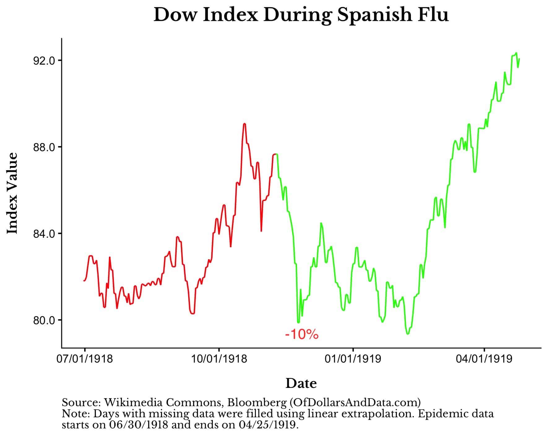
However, unlike the modern epidemics, the market stayed depressed for a few months post-peak.
This suggests that market participants thought that things could get worse. Or, it is also possible that these depressed prices had nothing to do with the Spanish flu whatsoever. We can’t know with certainty.
But think about what this tells us. A global pandemic that killed 3% of the Earth’s population only sent markets down 10% over a period of 4 months.
This is a stunning result. The worst virus since the bubonic plague and markets go through a run-of-the-mill decline? I would not have guessed that beforehand.
And it is unlikely that coronavirus will be anywhere near as catastrophic as the Spanish flu because of our greatly improved medical knowledge over the past century. However, this does not imply that the economic costs will be lower.
If anything, the economic costs of coronavirus are likely to be higher than prior epidemics as we take larger preventive measures to stop the virus from spreading. Cancelling tens of thousands of flights to the most populous country on Earth is just one example of this.
We can speculate on this in every way we want, but no one knows what will happen. If history is any guide, coronavirus is likely to cause a small, but temporary, pullback as it continues to spread.
But once things begin to improve, the market is likely to get out of its funk and recover its losses. Another crisis will be averted and humanity will march on.
No matter what happens, please stay safe out there and thank you for reading!
If you liked this post, consider signing up for my newsletter.
This is post 162. Any code I have related to this post can be found here with the same numbering: https://github.com/nmaggiulli/of-dollars-and-data