


After traveling the world for over five years aboard the HMS Beagle, Charles Darwin returned to England on October 2, 1836. You would think that after half a decade of documenting the unknown flora and fauna of the globe Darwin would sit down and write up his theory on evolution. But, that didn’t happen. As Bill Bryson notes:
It wasn’t until 1842, six years after his return to England, that Darwin finally began to sketch out the rudiments of his new theory.
However, even this wasn’t enough to get Darwin to finish his most famous work. It would take a letter from Alfred Wallace, another English naturalist, to force Darwin to collect his thoughts. The letter, which arrived 16 years after Darwin’s initial drafts, contained Wallace’s own independently discovered theory of evolution. Darwin saw the writing on the wall and knew he had to act fast. Over the course of the next year Darwin worked furiously to finalize his ideas. He published On the Origin of Species in November 1859, over 23 years after returning from his worldwide voyage.
We look back upon history as a series of events that seem simple and logically connected. Darwin traveled the world, studied animal behavior, and then immediately came up with the theory of evolution. But that’s not how things unfolded. History isn’t so simple. It actually took over two decades of pondering and working on other matters before Darwin finalized the ideas that would revolutionize biology. Nothing happened, then everything happened.
The same can be said of investing, where mostly smooth growth is occasionally interrupted by violent fluctuations. Morgan Housel said it best when he compared investing to being an airline pilot:
Ninety percent of the job is uneventful to the point of automation; ten percent of the job is terrifying and requires complex skills and a flawlessly calm demeanor.
Nothing happens, then everything happens.
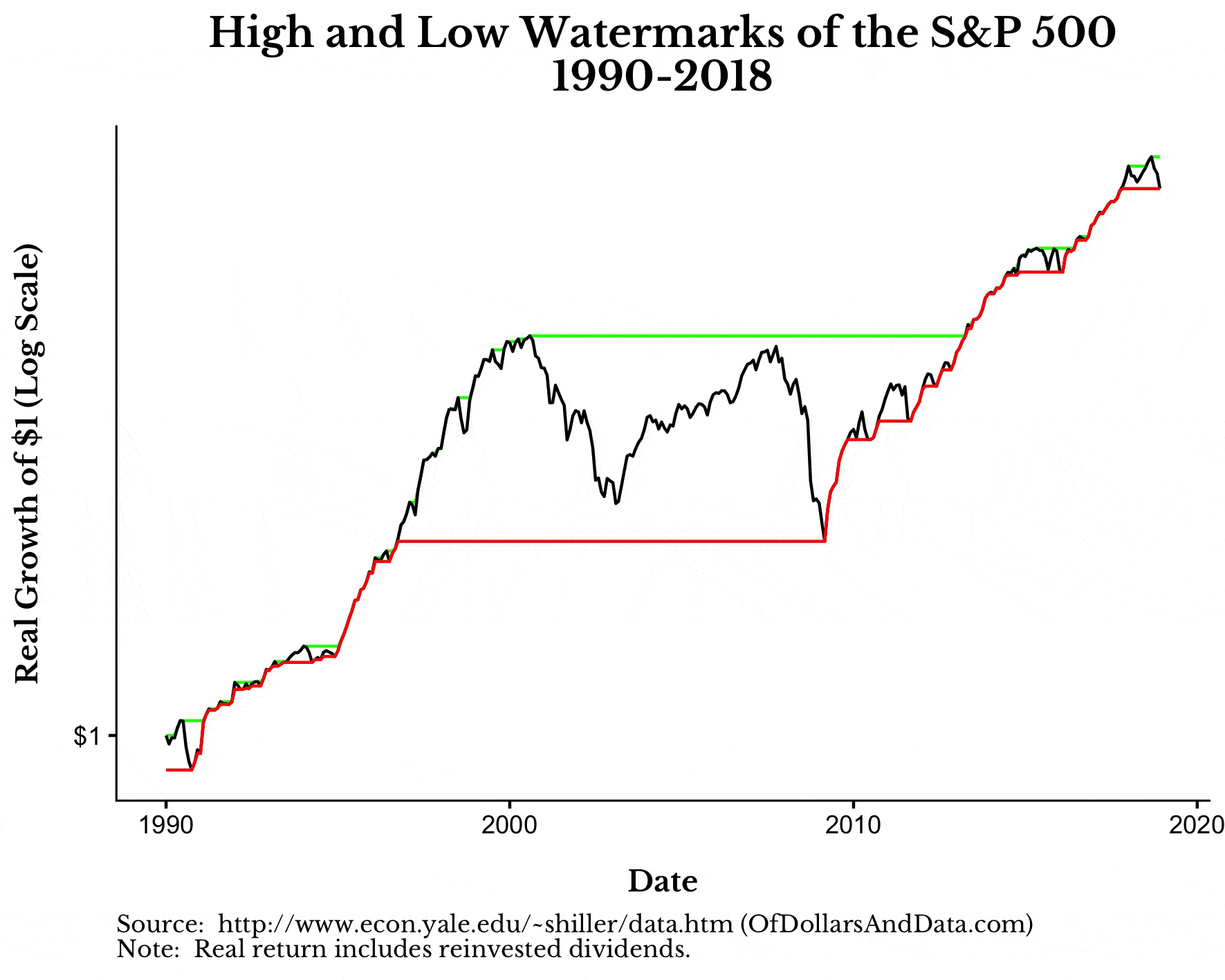
To illustrate this concept I am going to show you a different way of looking at price charts. First, I am going to show you the growth of $1 for the S&P 500 from 1990-2018 (using a log scale for the y-axis). However, I will also include what I am calling a “high watermark.” A high watermark represents the highest point ever reached by the S&P 500 as of that point in time. This high watermark (in green) stays at its level unless it is surpassed at some future point in time:

Okay, now I am going to show you the same chart, but I will also add a low watermark (in red). The thing about the low watermark is that it shows the lowest point ever reached in the future and goes backward in time to the first time that point was reached:

For example, in March 2009, the S&P 500 hit a low. This low was first reached (on a total inflation-adjusted basis) in October 1996. This means that from October 1996 to March 2009, the S&P 500 would have ~0% real total return. This explains why the red line above goes back from the low in March 2009 to October 1996. These watermarks might seem slightly confusing now, but bear with me.
Now imagine the chart above without its price and only with its watermarks. By looking at the chart this way (see the animation below), we can see the periods where nothing happens and where everything happens in the market:

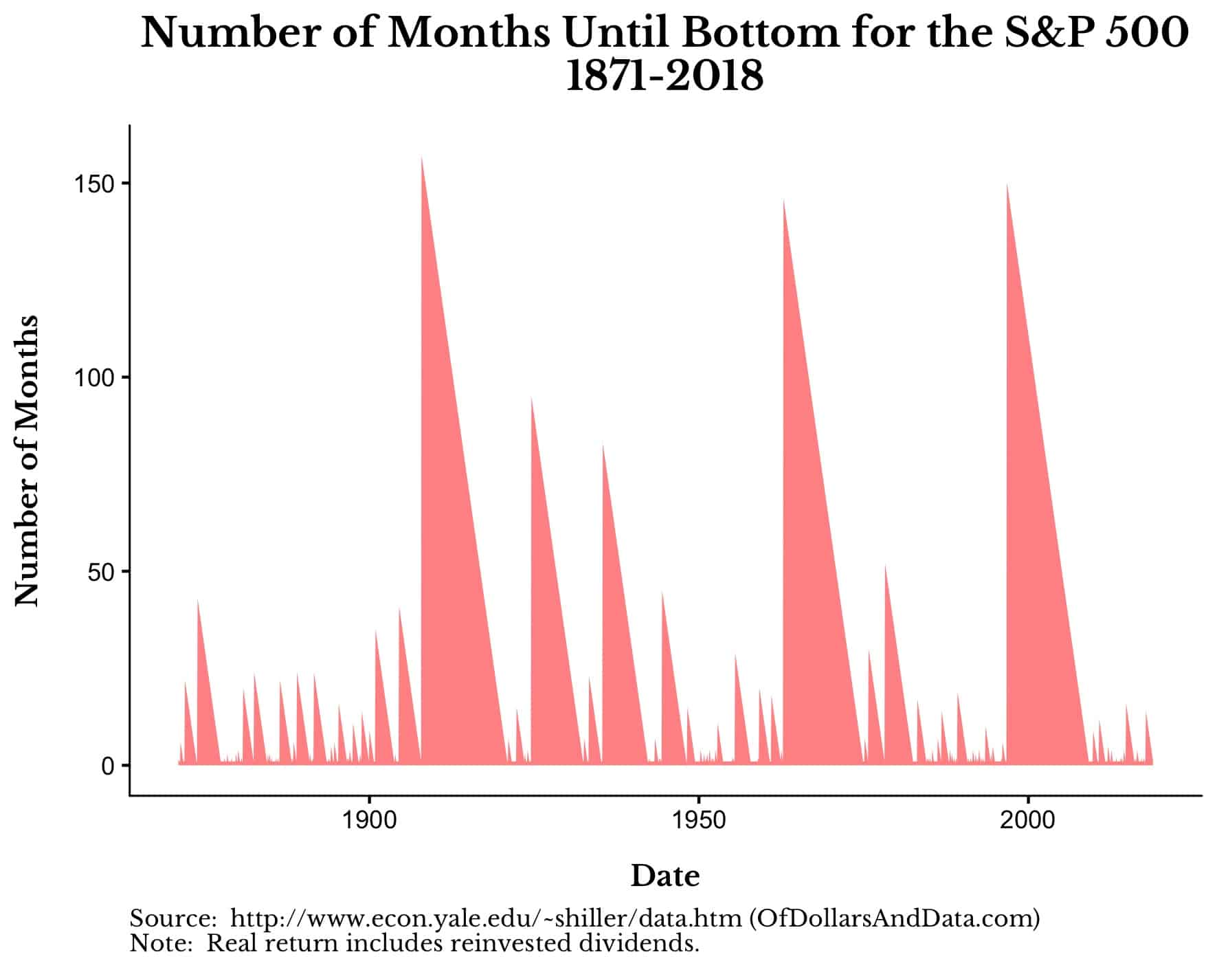
This chart shows how the growth of the S&P 500 is occasionally marked by extreme price swings. If we look over a longer time period (starting in 1871) this will become even more obvious (Note: This chart says S&P 500, but it is technically U.S. stocks as sourced from Robert Shiller):
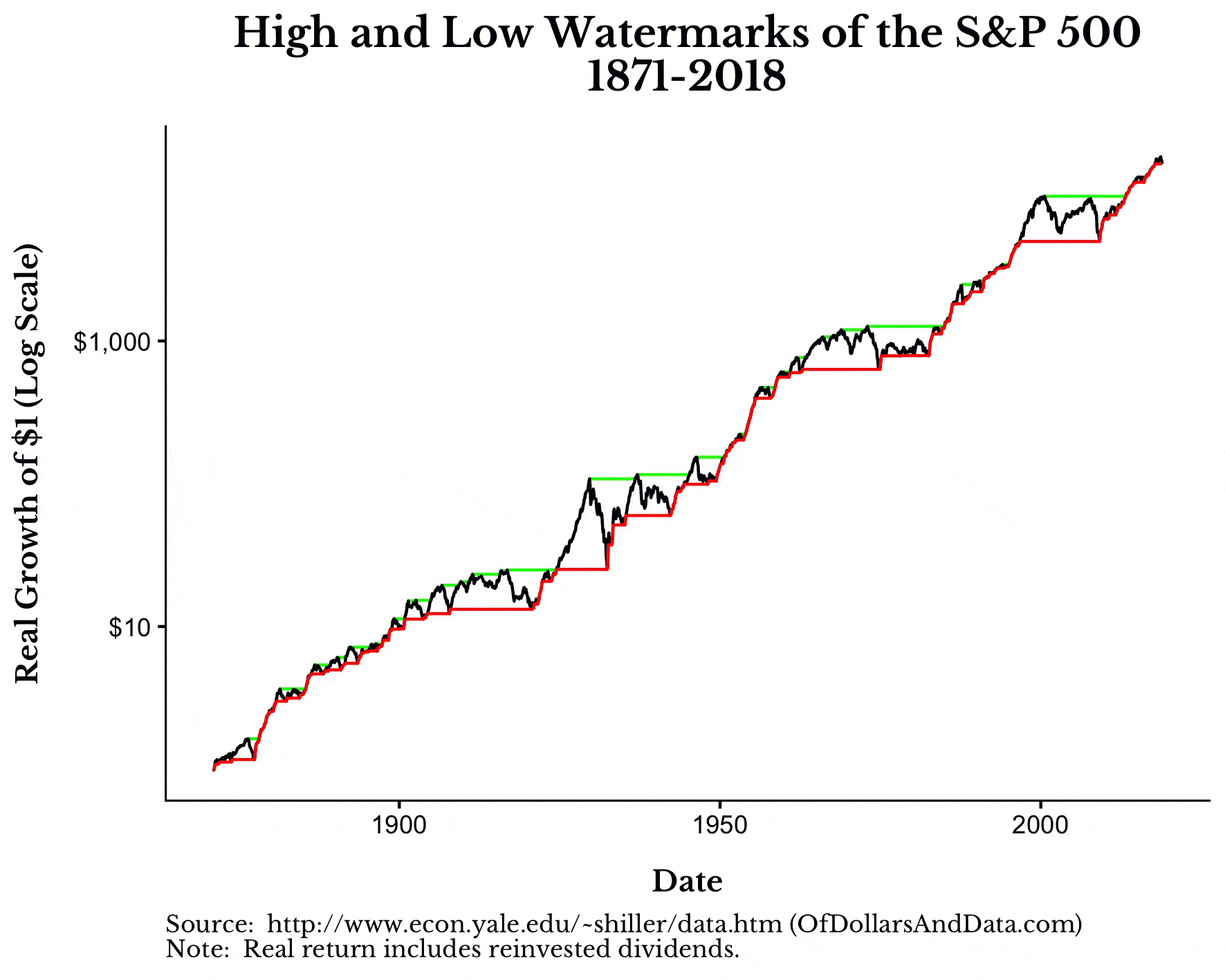
I love this chart because it illustrates how the U.S. stock market has been characterized by fits and starts throughout its history. For example, while decades like the 1950s, 1980s, and 1990s were mostly filled with growth (i.e. bull markets), the 1970s and 2000s contained large price fluctuations (i.e. bear markets).
This reminds me of one of my favorite charts ever created by Michael Batnick:

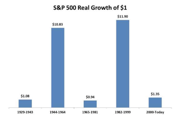
This chart is so good because it communicates a deep insight about markets in such a simple way.
However, not all markets exhibit the same fits and starts as the U.S. If we look at the Japanese stock market (i.e. the Nikkei) from 1970 until 2018, we see a far different picture:
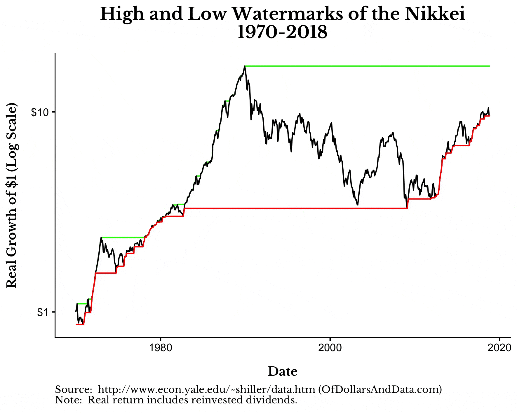
The big run-up in Japan starting in the mid-1980s led to a period of massive overvaluation that still has not been surpassed to this day (i.e. the high watermark is unchanged). It took over 300 months for the Nikkei to reach the bottom from its top in the late 1980s:

This is insane because 300 months is over double the maximum number of months from top to bottom in the U.S. stock market anytime 1871:
My point wasn’t to bury you in charts, but to illustrate that while market growth is usually lumpy, not all markets will follow this tendency.
As Go Markets, So Goes Life
The first time I learned about how equity markets regularly shift between calm and chaos, I was in awe. What caused such a result? Was it the psychological cycle between fear and greed? Was it something else entirely? I still don’t know for sure.
But, as I ponder this idea more deeply, I only ask, “Is life really all that different?”
We all go through hardships. We all go through stress. But, we also experience periods of relative calm. It’s the shift between these states that makes life worthwhile. What would life be without struggle and overcoming obstacles? It’s in overcoming these obstacles where we receive our greatest returns.
They say that it takes 10 years to become an overnight success. Don’t forget this as you approach each and every day. First nothing happens, then everything happens. Thank you for reading!
If you liked this post, consider signing up for my newsletter.
This is post 115. Any code I have related to this post can be found here with the same numbering: https://github.com/nmaggiulli/of-dollars-and-data