When it comes to the stock market, there seems to be just one question on everyone’s mind lately: Is this another dot-com bubble in the making?
Whether it’s IPOs hitting 1999-like levels, retail investors flooding the markets, or the tech bubble bursting again, there’s no shortage of headlines suggesting that we are experiencing a dot-com déjà vu. And a periphery glance at current market conditions — culminating in last week’s largest software IPO debut of Snowflake — would seem to confirm the alarm bells of those who are pattern matching today’s sequence of events with those from the internet bubble craze.
Half a year into Covid-19, there has been an ongoing rally of tech stocks, rising equity valuations, and a recent surge in retail trading activity, leaving many investors wondering just how much higher stocks can climb. However, despite some similarities between today’s market and the market of the late 1990s, this is where the resemblance ends.
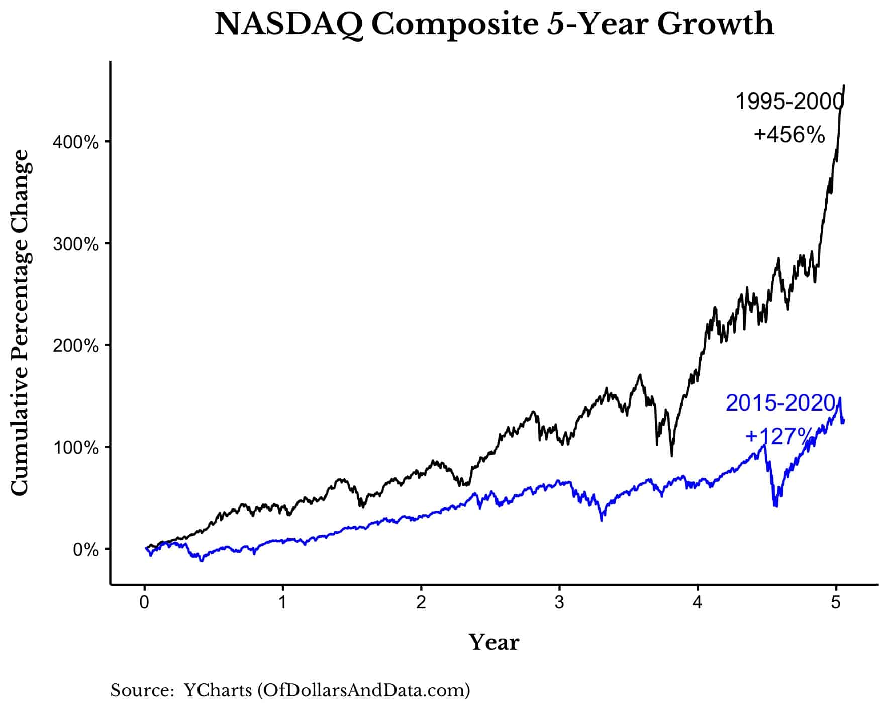
One big piece of evidence that suggests that we are not repeating the dot-com bubble is the much lower (yes, lower) growth rate of technology stocks compared to the late 1990s. For example, over the past five years the Nasdaq Composite has increased in value by 127%, which pales in comparison to the 456% growth in the Nasdaq during the heyday of the dot-com era:
One of the hallmarks of market bubbles is that no one can see them coming until after they burst. Otherwise, everyone would be in the predictions business — especially during the extraordinarily uncertain pandemic times we live in now. But with the benefit of hindsight, it’s possible to see how previous economic cycles compare to current ones.
As you can see above from comparing the Nasdaq Composite five-year growth rate between 1995 to 2000 versus 2015 to 2020, there’s “bubble behavior” characterized by modestly exuberant market behavior — and then there’s “BUBBLE behavior,” where the Nasdaq growth rate during the ’90s quadruples that of the past five years. The difference can be seen in the level of euphoria and the extent of overall price changes in the markets. While most of the price changes in the late 1990s were driven by high expectations, far more of the price volatility seen today are driven by changes in improving fundamentals and earnings.
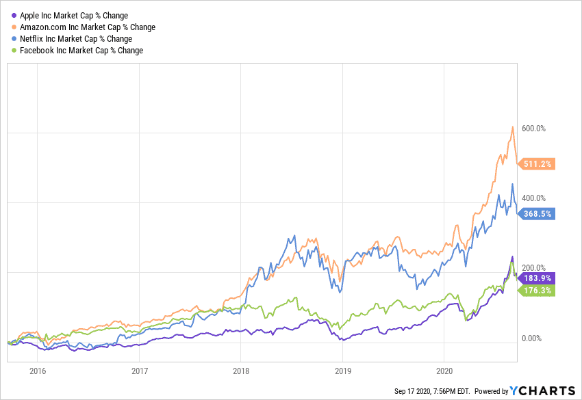
And if we examine some of the best individual stocks over these two time periods, we see a similar difference in total performance. Below is the change in market capitalization of some of the biggest tech performers over the past half decade: Amazon, Apple, Facebook, and Netflix.
And here is the same chart but for some of the best performers during the dot-com bubble: Microsoft, Intel, Cisco, and Oracle.
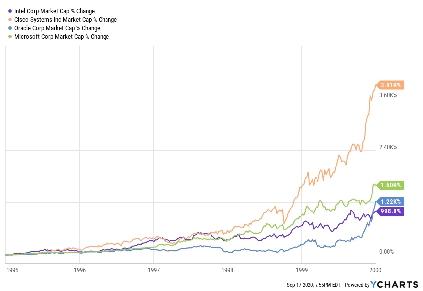
As you can see, the difference in market cap percentage growth is night and day. While today’s tech giants grew roughly 2.5x to 6x over the last five years, the biggest tech companies during the late 1990s grew between 11x-40x. This difference in growth is also proportional to investor expectations surrounding the future of technology companies.
Investors in the late 1990s bid up prices very high, very quickly because they believed in a future where tech companies would dominate the economy and transform productivity and society. I don’t necessarily think these investors were wrong, but they were far too early. Today’s investors have a more reasonable gauge of tech’s role in the economy, and stock prices reflect this rationality.
But what about the IPO market? With the recent listing of Snowflake ($SNOW) in what was the largest software IPO ever, some have argued that this is reminiscent of the dot-com bubble where the share price for technology companies routinely doubled or more on their first day of trading. There is even more firepower for this argument given that Warren Buffett — who is notorious for his aversion to tech stocks and IPOs more generally — got in on the action as well. (For context, Ford’s IPO in 1956 was the last new public company IPO Buffett invested in.)
Snowflake’s astronomical valuation aside, the frenetic market behavior surrounding this summer’s IPO craze isn’t necessarily a cause for concern. Just because some companies are being bid sky high doesn’t imply that the entire market is in a bubble of dot-com-sized proportions. After all, should we judge the market as a whole based on the prices of the few? Investors have been overpaying for assets for centuries, why would that behavior change now? Put another way: the exception doesn’t prove the rule.
While I agree that some companies or sectors may be overvalued today (for example electric vehicles as the hype around Nikola proves), I don’t think we can then make a blanket statement conclusion that the entire market is overvalued as well.
In fact, stock valuations are far lower today and more in-line with investors’ expectations than during the late 1990s. For example, if we examine the cyclically adjusted price-to-earnings (P/E) ratio of U.S. stocks since the 1960s, you can see that valuations today are nowhere near what they were in the late 1990s. P/E ratios are a helpful metric to see whether a company is over- or undervalued by measuring its current share price relative to its per-share earnings. A high P/E typically indicates that a company is overvalued, or that investors expect growth potential in the company. (Zoom’s controversial valuation is a good example of investors feeling strongly about the company’s future growth as a pandemic mainstay.)
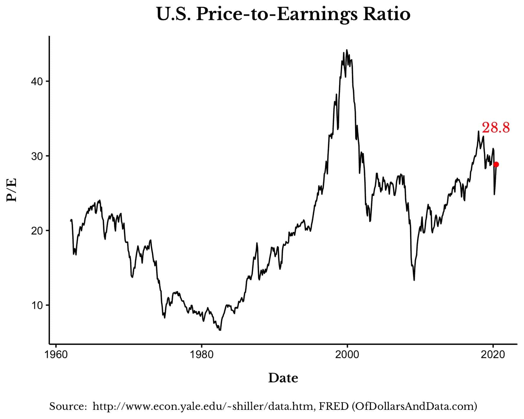
As you can see, the current P/E ratio of 28.8 is far below the high of 44 in December 1999, suggesting that stocks are only somewhat expensive relative to historic trends. Credit Suisse recently echoed this point when they stated that tech stocks were “only modestly expensive” when using free-cash-flow yield to compare to the broader market. Free-cash-flow reflects the actual cash being generated by the business, which makes it, arguably, a better metric than earnings which can be inflated through accounting sleight of hand.
In addition, if we take the inverse of the P/E ratio, also known as the earnings yield (E/P), we can see how today’s valuations seem quite reasonable given investor expectations. For example, with a P/E of 28.8, this implies an earnings yield of 3.5% (1/28.8) for U.S. stocks. This means that investors are willing to pay $1 for every 3.5 cents of earnings they get from the stock market.
However, investors have options for where to park their money beyond the public equity markets. They can also take their $1 and invest it in other securities, such as U.S. Treasury bonds. But, with 10-Year U.S. Treasury bonds currently only yielding 0.68% annually (the lowest on record), you can see how the 3.5% earnings yield on U.S. stocks can seem quite attractive. For context, 10-Year U.S. Treasuries have, on average, yielded 6% annually since 1962.
The higher yield on U.S. stocks is meant to compensate investors for the larger risks they take when investing in stocks instead of bonds. After all, U.S. bonds are considered to be essentially risk-free in that the U.S. government is unlikely to ever default on its obligations. Given this lower level of risk, we would expect the yield on U.S. bonds to almost always be lower than the earnings yield of U.S. stocks.
However, during the height of the dot-com bubble, 10-Year U.S. Treasuries were yielding 6% while U.S. stocks had an earnings yield of only 2.2%:
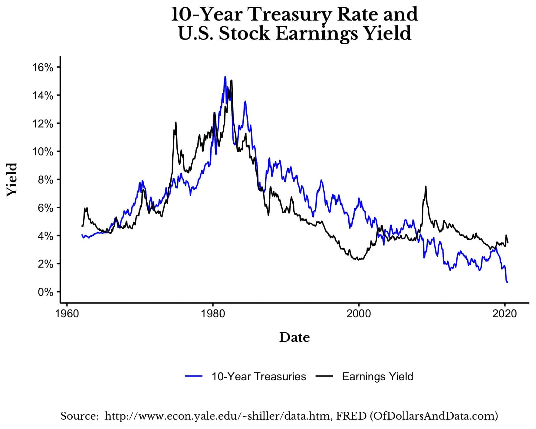
This difference in yield helps explain why the dot-com bubble eventually burst. Investors collectively woke up, smelled the proverbial coffee, and thought, “Why should I accept a 2.2% yield on these risky stocks when I can get 6% from these risk-free bonds?”
Well, today the story is quite different since stocks are yielding 3.5% while bonds are yielding less than 1%. It’s worth noting that bond yields have been declining globally for around a decade, a trend that predates the pandemic with most countries having negative yields now. This logic implies that investors can justify today’s stock prices on the grounds that “there is no alternative.” After all, short of gambling, what other investment options do investors have?
If we look at the earnings yield of U.S. stocks minus the 10-Year Treasury rate we can see this more clearly:

Relative to U.S. bonds, stocks were the least attractive during the height of the dot-com bubble. This is a far cry from today where stocks look far more attractive relative to their fixed income counterparts. Of course, this doesn’t imply that stock valuations can rise indefinitely, but it does illustrate just how different today’s “high valuations” are from those of the past.
Whether we look at valuations, the IPO market, or the growth of tech stocks at large, there is little evidence to suggest that we are witnessing a rerun of the dot-com era.
While it is always useful to remain cautious as an investor, it’s also important to look at the concrete data and come to a more analytical conclusion about how today’s market trends compare to the dot-com crash. And that data show that valuations are lower than they were in the late 1990s and that the valuations of today coincide with historically low bond yields. These two facts taken together suggest a market that has far less froth than the one of over two decades prior.
A version of this article was originally published on Marker.
If you liked this post, consider signing up for my newsletter.
This is post 206. Any code I have related to this post can be found in “0007_not_dotcom.R” here: https://github.com/nmaggiulli/of-dollars-and-data/blob/master/analysis/_fl