There’s an old saying that, “A lie travels around the globe while the truth is putting on its shoes.” Last week I saw this quote in action after someone tweeted out a chart showing the year-to-date (YTD) returns of the NASDAQ Composite vs. the NASDAQ Composite with the top 5 companies excluded:
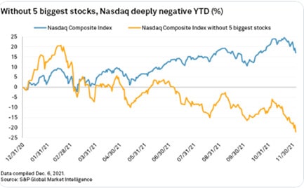
As you can see, the NASDAQ Composite is showing a 15% YTD return while the NASDAQ Composite (ex top 5) is showing a negative 20% YTD return. When Michael Batnick sent this chart to me I knew something was amiss. How could the other 3,500 or so stocks in the NASDAQ Composite being doing so badly? It seemed far-fetched.
So I ran a similar analysis using the NASDAQ 100 and got a very different result:
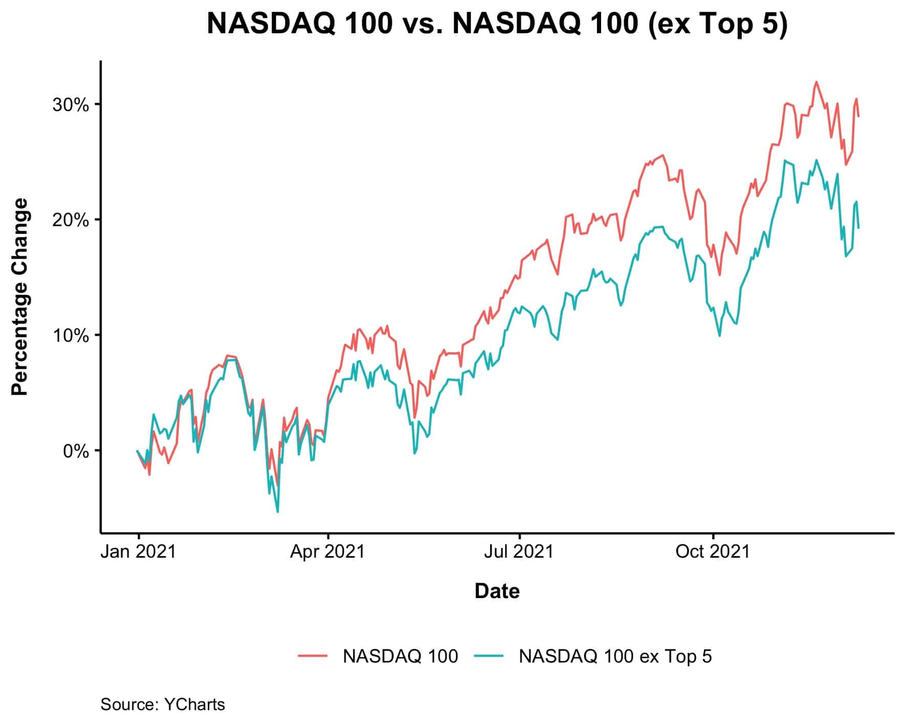
In this chart the NASDAQ 100 is up 28% YTD while the NASDAQ (ex top 5) is up 19% YTD. This seems more believable and inline with my prior expectations. Yes, the biggest stocks have done better, but not that much better than the rest of the index.
Michael tweeted out my corrected chart but got immediate pushback. “That’s the NASDAQ 100 not the NASDAQ Composite.” Technically yes, but I was skeptical that this would make a difference. So I looked it up to be sure.
The NASDAQ Composite has around 3,500 companies in it with a total market capitalization of $19 trillion (as of March 2021). But guess what? Around the same time the NASDAQ 100’s market cap was around $17 trillion.
This implies that the smallest 3,400 companies in the index are only worth $2 trillion!
So let’s do some quick math. If the NASDAQ 100 (ex top 5) started 2021 with a market capitalization of $9 trillion, when we add in the other 3,400 companies from the index we get $11 trillion. That’s $11 trillion for the NASDAQ Composite (ex top 5) to start the year.
But we also know that the NASDAQ 100 (ex top 5) is worth about $10.5 trillion today. So even if every one of the 3,400 smallest companies in the NASDAQ Composite went to $0, the index (ex top 5) would have only declined from $11 trillion to $10.5 trillion or by about 5%. This is nowhere near the -20% shown in the first chart above.
Voilà! Chart crime confirmed. Not only did the 3,400 smallest companies in the NASDAQ Composite not go to $0, but even if they had, the YTD returns for the NASDAQ Composite (ex top 5) would not have been -20%!
As a sanity check, I compared the YTD returns of all the stocks in the Russell 3000 by size decile (i.e. 10 groups of each size) and, as it turns out, the absolute smallest stocks in the Russell 3000 have performed the best this year:
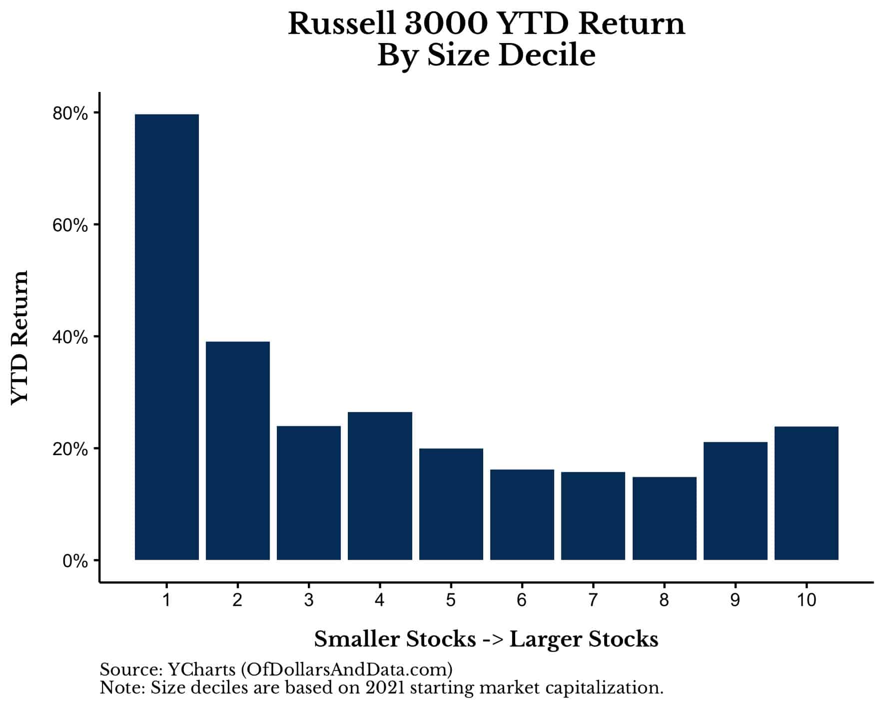
Yes, the smallest stocks in the Russell 3000 aren’t the same as the smallest stocks in the NASDAQ, but you get my point. The chart that started this post is not just wrong, but horribly wrong. Yet, it was shared thousands of times before being debunked.
I raise this point because we now live in an age of financial misinformation. An age where a misleading chart/data supporting a false narrative can take the financial world by storm. I’ve seen it more times than I can count.
For example, who could forget the time when someone tweeted that Michael Bloomberg’s presidential campaign could have given every American $1 million instead of running ads? Or this tweet suggesting that the entire growth in the S&P 500 since 2008 is due to Fed balance sheet expansion, though the U.S. economy is 50% bigger today than it was in 2008?
These are just two examples among many. If you don’t believe me, consider this massive thread from @Econompic that has documented hundreds of financial chart crimes over the years. While most of these examples were harmless, what wasn’t harmless was how quickly they were shared amongst a large number of people.
The speed at which information can be shared matters because of how we form beliefs. As Annie Duke explained in Thinking in Bets, we tend to form beliefs in the following way:
- We hear something;
- We believe it to be true;
- Only sometimes later, if we have the time or inclination, we think about it and vet it, determining whether it is, in fact, true or false.
As you can see, the checking part comes at the end, if at all. This is the problem.
Because it’s never been easier to spread financial information, but also never been harder to check it.
The advances in computation over the last few decades have allowed for anyone with some programming ability to analyze lots of data and provide conclusions to the broader financial community very quickly. That’s generally a good thing. This blog wouldn’t exist without these innovations.
On the other hand, complicated financial information also requires more time to check than it does to spread. This is especially true if the data is particularly large (i.e. cant fit in Excel) or if it requires complex data manipulation. The chart that started this post falls into this category. Most people who see it wouldn’t know where to get the market capitalization of every company in the NASDAQ Composite (neither do I tbh), and even if they did, how would they check it?
But this is just the tip of the financial misinformation iceberg. Because it isn’t just incorrect information that’s the issue, but misinterpreted information as well. For example, last week I tweeted out this chart from Bloomberg showing how net equity flows this year have eclipsed the combined inflows of the past 19 years:
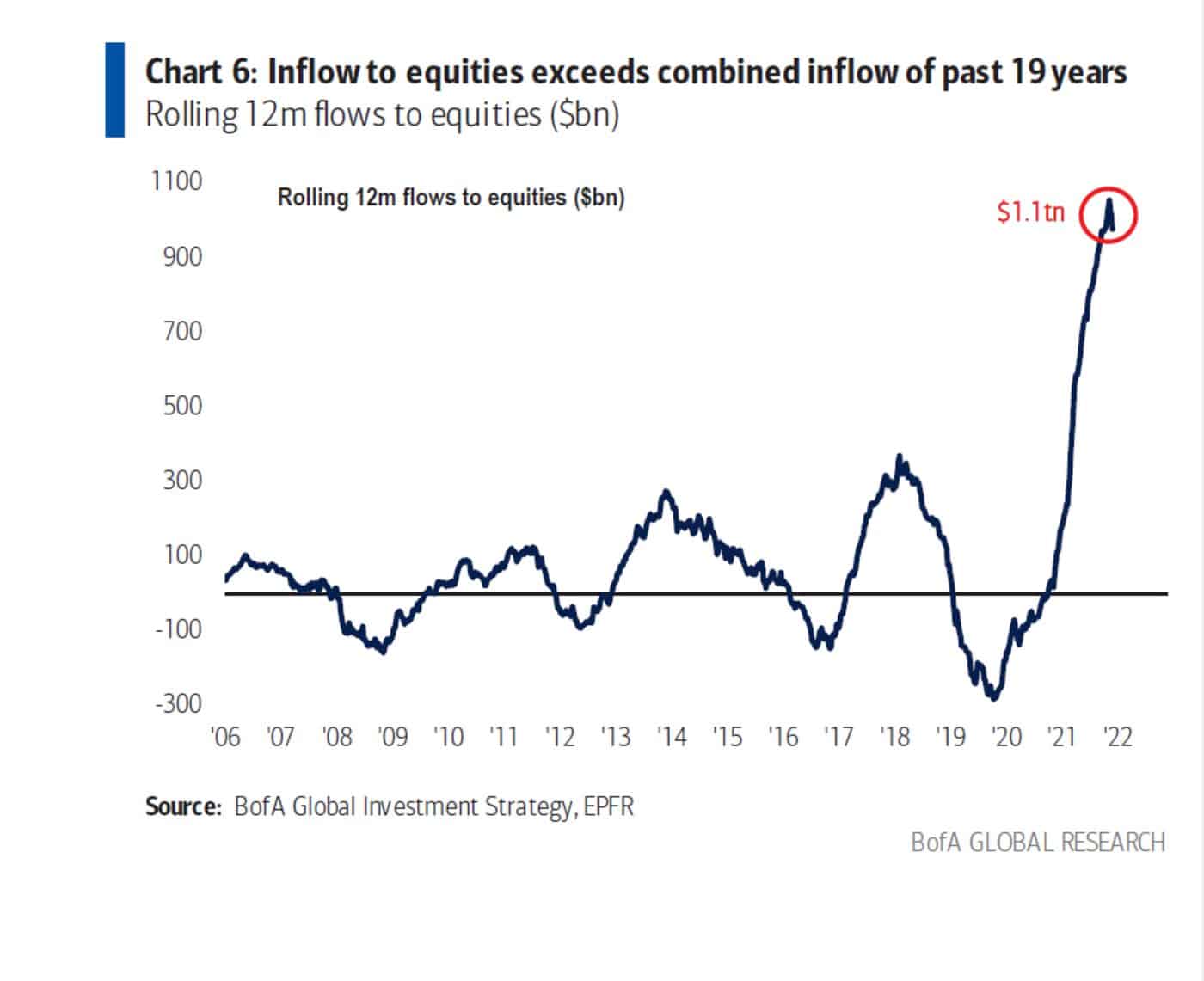
Many people who first see this chart think something like “do you see what happens when the Fed prints trillions of dollars?” And this isn’t wrong, but it also isn’t right either. Because this chart is showing net flows to equities it can only rise when there are more new dollars entering the space. Since every buyer of an equity has to be matched with a seller, net flows should be zero (or close to it) most of the time.
This is true unless new equities come to market. When new equities are issued (via IPOs, SPACs, etc.) then net flows can increase. This is exactly what the chart above is showing. Unfortunately, most people (myself included) probably didn’t interpret it this way when they originally saw it. This isn’t a major issue, but highlights how financial misinformation can occur even when the data being presented is completely accurate.
I tell you this because I feel like the increased information overload has led more people to abandon their due diligence simply because they don’t have enough time to process and check all of it. I agree that you don’t have to double check every number you ever see, otherwise you wouldn’t be able to get anything else done.
However, when you see a financial result that is shocking or unexpected, you should be skeptical before accepting. Do some sanity checks. Talk to some experts. Figure out if it makes sense. Then tell others.
You won’t win any contests by doing so, but you will be more trusted if you do. I’ve definitely struggled with this in the past, but I am trying to improve every day. Learning to slow down in a world that is speeding up may be the only way to stay ahead of the curve.
Happy investing and thank you for reading!
If you liked this post, consider signing up for my newsletter.
This is post 272. Any code I have related to this post can be found here with the same numbering: https://github.com/nmaggiulli/of-dollars-and-data