Before I show you the data for this week’s post I want to talk about a myth I have seen in the personal finance industry that I used to agree with. The myth is that the poor are poor because they have bad money management skills and they don’t spend their money wisely. The thinking goes that if the poor could just control their spending they could save money and become rich. The problem with this conclusion is that the data does not support it. After examining U.S. household spending data for different income levels, it is clear that it is not their spending, but their income that is the issue.
The data I am going to use to illustrate this is from the Consumer Expenditure Survey by the Bureau of Labor Statistics. The date ranges from 1984–2015 and provides average annual household spending across many different categories and subcategories, broken out by particular characteristics. To see a cool interactive visualization using this spending data (I want to learn how to do this eventually), check out this article from FlowingData. The main characteristic I am going to focus on is the different income quintiles (0–20%, 20–40%, etc.) and how they spend their money relative to their after-tax income.
For the first few charts below I want to focus on 4 categories in particular that I will refer to as “basic necessities”: Food, Housing, Healthcare, and Transportation. These 4 spending categories are mostly non-negotiable on an annual basis, which is why they are good to look at to understand the absolute minimum in spending habits. One caveat with this analysis is that it does not control for age or family size. So though the spending habits of the lower 20th percentile of income are shown below, remember that this can include younger individuals with less work experience, those in college with little to no income, or those households with fewer earners. For perspective, in 2015, the average annual after-tax income of the lowest 20 percent was $11,400:
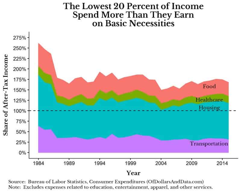
As you can see from the chart above, the lowest 20 percent of income earners spend more than 100% of their income on basic necessities and have been doing so for decades. The y-axis represents the percentage of after-tax income that is spent on each category (combined). And keep in mind that the BLS includes government benefits, unemployment, retirement plans, and social security as a part of its income measure. For more information on variable definitions see here. Now compare the above chart to the next 20 percent of income earners who earned ~$29,000 after-tax in 2015:
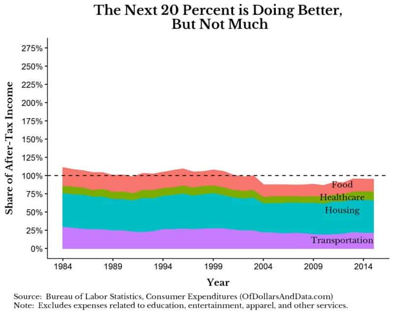
While the 20–40th percentile of income earners are clearly better off than the lower 20%, they are still spending almost all of their income on the essentials. Once you add in other expenditure categories the 20–40th percentile have nothing left to save.
As a comparison I have also included the top 20% who spend roughly half of their income on the basic necessities, though the quality of these necessities is definitely higher than for the other income groups (i.e. better housing, better food, etc.). In 2015, the upper 20% of income earners made $142,000 after-tax:
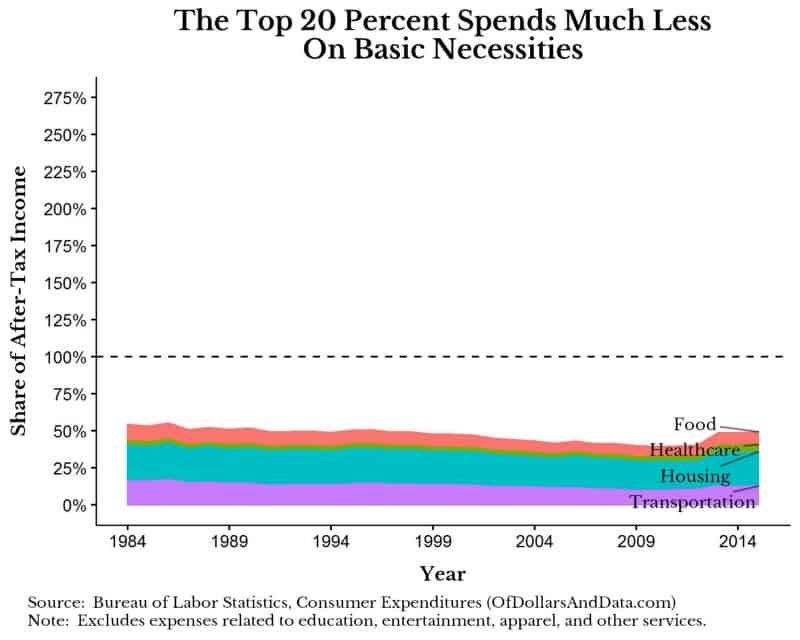
From these plots it is easy to see how tough it is for Americans to save who have lower incomes. All the self control in the world could not get them out of these situations, because you need to spend some amount on basic necessities. Some may challenge my spending assumptions, but I am trying to be realistic for most people. We can’t all eat for under $10 a month.
Taking this altogether, if we were to plot the after-tax income minus total average annual expenses for the 5 income quintiles, you can see a clear delineation in the ability to save money:
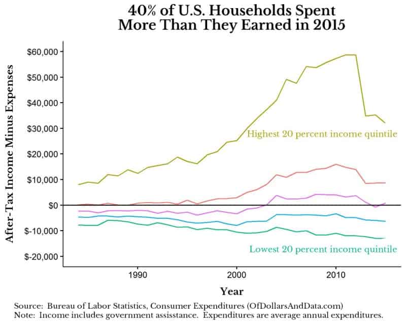
The bottom 20% of households spent $13,000 more than they earned in 2015 ($24,000 in spending vs. $11,000 in income). The next 20% spent $6,000 more than they earned ($35,000 in spending vs. $29,000 in income). The middle 20% was barely net positive with $46,000 in spending vs $47,000 in income.
Another thing that this chart doesn’t illustrate is that, over time, many households will move into different parts of the income distribution. Those who are in the lowest 20% don’t all stay there. This article from NPR states that “61 out of 100 U.S. households will break into the top 20% of incomes for at least 2 consecutive years”. While this shows some income mobility, the fact that the lowest 40% of households can’t save money is alarming.
The Real Driver of Poverty (and How to Get Out of It)
It is clear that getting out of poverty and building wealth will be driven more by income than spending. Don’t get me wrong, spending matters, but an individual can only cut out so much before they start questioning every purchase they make. The added stress from this mindset probably isn’t worth the marginal savings. From a pure happiness perspective one should have ample control of their spending (i.e. keep enjoying the lattes), and instead focus most of their energy on building skills to increase their income.
The one flaw in my approach above is that it is not easy to raise your income without getting some form of education, and given the poor are already spending over 100% of their income on the basics, it makes it incredibly difficult to find money/time for any form of education. All of this begs the question of what appropriate policy should we enact to mitigate this issue? (i.e. more progressive taxation?, basic income?, etc). I am not going to answer this, as I will likely discuss it in a future post, but it is something worth thinking about. Thank you for reading!
If you liked this post, consider signing up for my newsletter.
This is post 08. Any code I have related to this post can be found here with the same numbering: https://github.com/nmaggiulli/of-dollars-and-data