Every single day I see a question like this online:
“I just saved up $1,000 and want to invest. Where should I invest my money?”
Besides investing in yourself, there is one way in particular that has the greatest chance of making you the most money for the least amount of risk possible. The idea, as it is known in the investment community, is asset allocation. The purpose of asset allocation is to choose a particular mixture of assets (i.e. stocks, bonds, etc.) to get the greatest return per unit risk (i.e. most bang for your buck).
Many great investors have discussed the important of asset allocation for boosting returns while minimizing risk. David Swensen, the Chief Investment Officer for Yale, pioneered an approach for endowment investing based on proper asset allocation that has made him famous in the investing community. In addition, my favorite investment writer, William Bernstein, covers this topic in great detail in The Intelligent Asset Allocator. But don’t take their word for it, let’s dig into the data to see asset allocation at work.
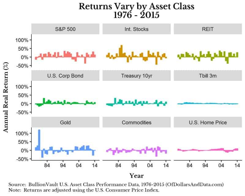
The data for this post comes from BullionVault’s U.S. Annual Asset Performance Comparison from 1976–2015 (40 years). I highly recommend that you look at this data on their site to get a quick feel for it. One of the main things I noticed about the data is how different the returns are for each asset class:
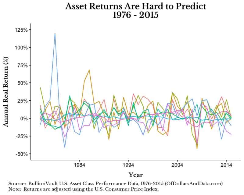
In addition, there is no pattern to the asset returns from year to year, making them hard (if not impossible) to predict:
Now that you have looked at the data I want to explain how asset allocation would work in this scenario. As I have stated before, the goal of asset allocation is to determine the mixture of assets for the highest return with the least risk over time. To do this, we have to do some computation and vary the amount of each asset in the portfolio to solve for that proper mixture. For the investment junkies this is called maximizing the Sharpe ratio. Essentially, you keep altering the mixture (weights) until you have reached a maximum point and then you are done. If we were to plot this process, we would get something like this:
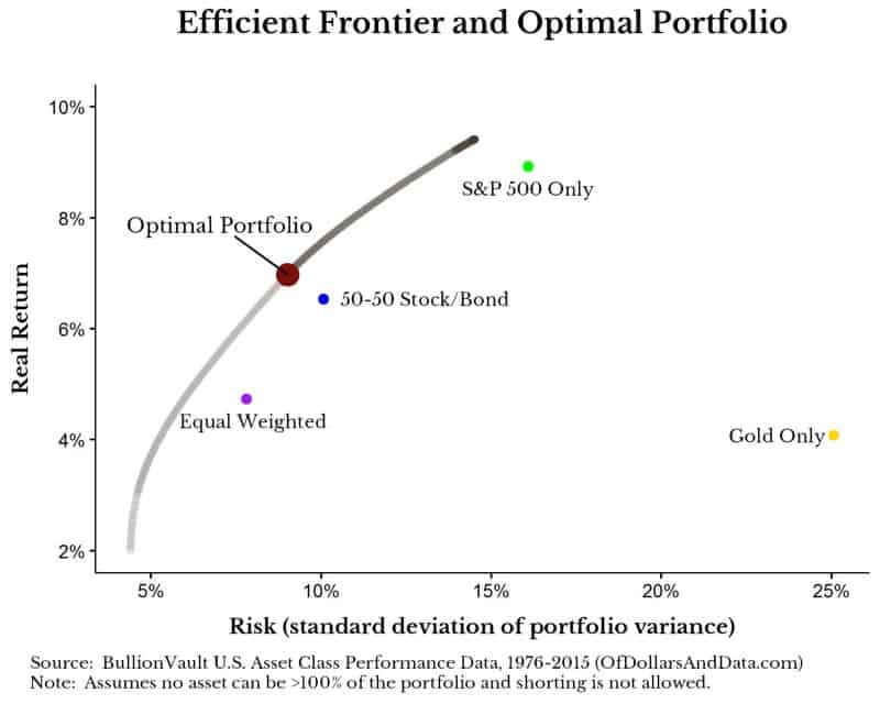
The x-axis is our level of risk and the y-axis is our level of return. The gray to black line represents something called the efficient frontier, which is the location along which a particular mixture of assets would be optimal for that level of risk and return. Imagine this as the “best of all possible worlds” given the assets you can choose from. The large red dot represents the optimal portfolio, or the point at which you get the most reward per unit of risk. In addition you will see other points labeled along the plot which represent other example portfolios that I included for comparison.
I know this is a lot to take in, but the key point is that it is better for you to move upward and to the left on this plot. You also can’t go above the efficient frontier with this particular set of assets over this time period. Additionally, the example portfolios shown above were selected to demonstrate how many conventional portfolios would either have more risk for less return, or more return and more risk than the optimal portfolio. In particular, “Gold Only” has the most risk of any asset class, yet it’s real returns are not great. You may assume that this means you should never buy gold…but wait for the punchline.
So what’s in the optimal portfolio? Before I tell you I need to preface this with one important fact about asset allocation: The time period and assets you use has a large impact on the optimal portfolio solution. If you ran this over a longer/shorter time horizon, the solver would likely spit out a different answer. If you had additional assets (i.e. small cap stocks, foreign bonds, etc.) the solver would likely spit out a different answer. If we knew with certainty that these asset classes would behave more or less the same as they did the last 40 years, then the optimal portfolio is a great solution. However, if any of the underlying fundamentals of these assets had changed, or if we got more data, we would find something different. With that being said, here is what is in the optimal portfolio:
- 34% U.S. Treasury 10yr Bond
- 29% S&P 500
- 24% REIT (real estate investment trust)
- 10% Gold
- 3% International Stocks (developed markets)
The most surprising thing about the optimal portfolio is that it contains 10% gold. How can this be true given that gold has such high risk and such a low return? This is where the solver beats conventional intuition. The reason gold, despite its individual shortcomings, can play a role in a portfolio is because it is less correlated with the other assets. When stocks and bonds go zig, gold goes zag. And that relationship makes it optimal to hold gold in this scenario.
Another surprising insight is the assets that are not in the optimal portfolio, namely, commodities, U.S. corporate bonds, and U.S. homes. Ironically, most U.S. households tend to have too much of their net worth in their home (their primary asset), and this solver recommends not even owning a home as an investment! Then again, these results are probably biased based on the time period, but that is what this data suggests.
Now that you know what is in the optimal portfolio I want to show you how this thing performs. All you have done is look. Now it’s time for a test drive.
To do this “test drive” I simulated historical returns using the 40 years of data I had (sampled with replacement) and then ran all of these portfolios through 1,000 simulations of a 40 year investment period. In the simulations I contribute $5,000 at the beginning of each year and rebalance my portfolio annually. Finally I calculated something called the maximum drawdown for each of the simulations.
A drawdown is the difference between your maximum portfolio value (up to that point in time) and your current portfolio value. Let’s say you have $100,000 and lose $10,000 over 1 year. The current drawdown would be $10,000. Let’s say another year goes by and you lose another $5,000. Now your drawdown is $15,000 as this is the difference between your maximum value of $100,000 (2 years prior) and your current portfolio value of $85,000. Let’s say in the next year you earn $14,000 bringing you to $99,000. This is still a drawdown of $1,000. Once you go above $100,000, your maximum is reset and your drawdown goes to $0. In this example, the maximum drawdown was -$15,000 or (-15%) as this was the most money you ever lost from your peak.
I calculate the maximum drawdown for each simulation because I think it highlights investment risk better than any other measure. The charts below will show the maximum maximum drawdowns across all 1,000 simulations to give you an idea of the worst case scenario. The shading differences represent density, or how many simulations have that level of losses. The lighter the shade, the fewer number of simulations have that drawdown. With that being said, here are the maximum maximum drawdowns that you could experience for the less risky portfolios:
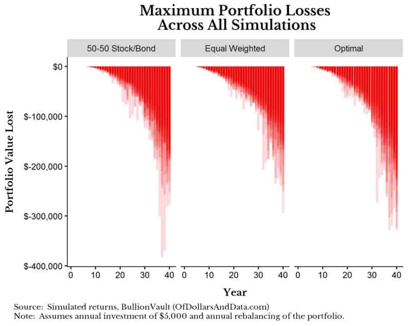
Worst case scenario (unlikely) you could be down about $300,000 from any peak if you invested in the optimal portfolio for these 1,000 simulations. However, this maximum drawdown is small compared to the riskier portfolios. Below are the maximum maximum drawdowns when we compare the Gold only and S&P 500 only portfolios to the optimal portfolio. Note: The y-axis has increased in range in the chart below, but I am showing the same data for the optimal portfolio as the chart above:
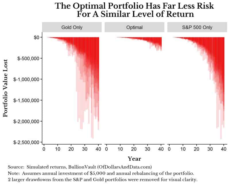
This drawdown plot illustrates the nature of investment risk. Now you may be thinking that it’s easy to argue against these riskier portfolios when you are only looking at the worst case scenario. I agree with this. However, even when we look at the median outcome there is a clear pattern. Below are statistics on the simulated ending values and maximum drawdowns across all 1,000 simulations:
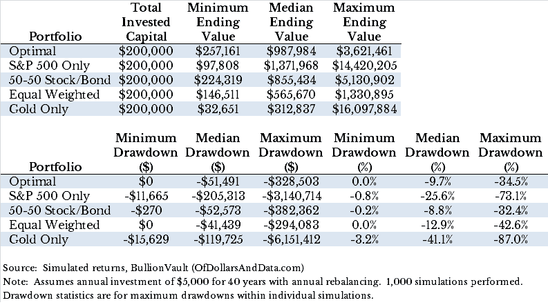
Looking at the portfolios above you will notice a few things. First, only the S&P 500 portfolio is expected to outperform the optimal portfolio over a 40 year period as it has a “Median Ending Value” of ~$1.4 million compared to ~$1 million for the optimal portfolio. However, that same portfolio will have much larger drawdowns over its investment lifetime (-25.6% vs -9.7%). So though you will likely get richer buying only the S&P 500, you will sleep a lot better with the optimal portfolio.
So…Where Should You Invest When You’re Investing?
Firstly, no one knows where the markets are going, so I cannot tell you which exact portfolio will perform the best over the next few decades. However, I can say with reasonable certainty that you should buy a diverse set of asset classes while paying the least amount of fees possible. The exact mix of those asset classes will depend on your goals, risk tolerance, and current financial standing. The nice thing about asset allocation is that it is doable with as little as $1,000 because you can buy Vanguard or Charles Schwab funds through each of their respective brokerage services without paying a commission.
Lastly, I have a bunch of Thank Yous for this post. Thank you to Andrew Matuszak for his post on the R portfolio optimization here. Thank you to my friend Tyler Danzey for coming up with the title of this post. Thank you to BullionVault for providing their data. And lastly, thank you for reading!
If you liked this post, consider signing up for my newsletter.
This is post 06. Any code I have related to this post can be found here with the same numbering: https://github.com/nmaggiulli/of-dollars-and-data