This week’s post concerns something that is well known to many investors: stock prices fall quickly and recover slowly. However, my real question is: how long, on average, does it take for the decline and subsequent recovery to occur?
To begin, let’s consider the following thought experiment:
Imagine you are magically transported to some month between 1920 and 2016 where the U.S. stock market just hit an all time high and we know with certainty that the market is going to drop 20% (i.e. a 20% drawdown) in the very near future. My question is:
How long, on average, would it take before you were down 20%?
And the more important follow-up question: Once you are down 20%, how long will it take to recover (i.e. reach a new all time high)?
I used Shiller’s U.S. stock market data and found that it would take, on average, 7 months before you declined 20% or more and 6 years to recover from that decline. The asymmetry in the results might surprise you, but you need to remember that once you have experienced a 20% drawdown, the market can always fall further. The nasty can always get nastier. [Side note: I use the Shiller U.S. stock market data a lot, but the more I torture the data, the more it seems to confess different financial insights!]
To provide more statistics on this, below you will find a table that shows, for various drawdown levels, the median number of years it would take to fall from a peak (column [A]) and to recover from that fall (column [B]). I used the median instead of the average to reduce the skew from outliers. Lastly, please ignore column [C] for now, as I will address it shortly.
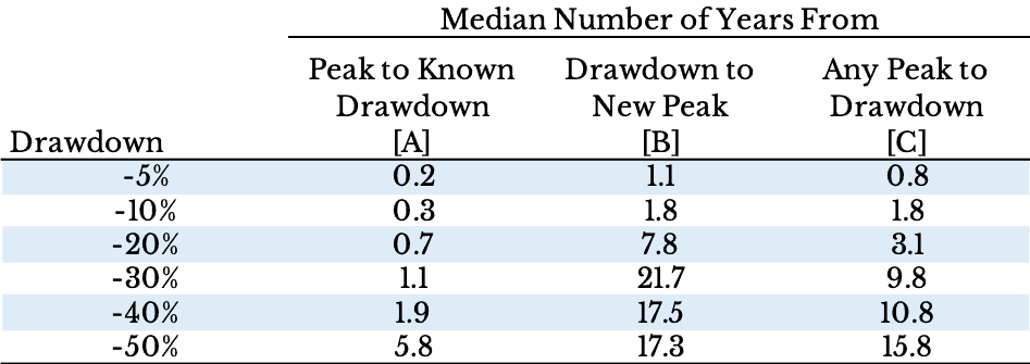
As you can see, when we know in advance that a certain drawdown will occur, the amount of time to experience such an event (column [A]) is usually quite short. While a 20% drawdown would take 6 months (0.5 years), a 50% drawdown takes about 2 years to unfold. However, given how small our sample size is (i.e. there are only three 50%+ drawdowns in the data), these statistics will likely not be helpful for understanding future market behavior.
If you focus your attention on column [B] you will notice that the time to recover once you have experienced a particular drawdown is much larger than the fall time (column [A]). This is true because many smaller drawdowns can become larger as markets get more chaotic. In other words, every 50% drawdown was once a 5% drawdown.
Though this data suggests that once you are at a peak that drawdowns happen quickly, I will admit there is some selection bias going on with column [A]. I stated that the drawdown had to be known beforehand. However, this is never the case. Many times, when you are at a peak, in the next few months you will likely hit an even higher peak. Therefore, I need to correct for this selection bias.
In order to do this, I created column [C] to allay any fears. Column [C] provides the median number of years from any peak to a specific drawdown level. So, given you have hit a random all time high, it would take roughly 5 years before you experienced a 20% drawdown. This time period is much longer than the one in column [A]. Why? Drawdowns, especially larger ones, have been historically rare.
To provide a better visual aid to this, let’s look at a log plot of the S&P 500 real price + dividends from 1920 to 2016. I have shaded this plot red whenever the market falls 20% and green from the moment after it falls 20% until its next all time high. Therefore, the red bars represent declines and the green bars represent recoveries.
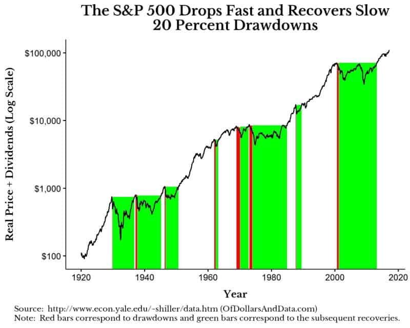
As you can see, there is far more green then red in this chart, which illustrates the point of this post. You may also notice that some of the declines happened so quickly that the red bars don’t plot well on the chart. For a clearer visual, consider the same plot with 40% drawdowns:
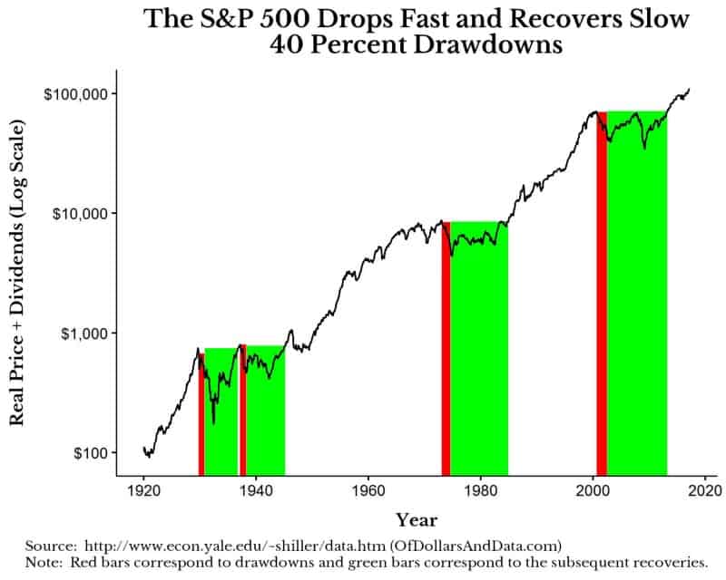
The most interesting thing about this plot to me is that the recovery from the dotcom bubble in 2000 was the longest in U.S. stock market history, after adjusting for inflation. From the peak, it took roughly 13 years before the highs of the dotcom bubble were reached again.
The Stock Market is Like a Ladder
Some of you may be wondering why I had a picture of a ladder at the beginning of this post, and the reason is that it seems to be a decent, though imperfect, analogy for equity price behavior. Prices go up slowly, like someone climbing a ladder. However, once in a while, people slip and the subsequent fall occurs much faster than the climb up. Unfortunately, depending on the damage suffered from the fall, some investors decide to never get on that ladder again.
This was a fun exercise to do, but may not provide much value in the future if market behavior differs from its own history. For example, in modern markets, individuals and machines better understand the concept that the U.S. stock market has, historically, always recovered. As a result, future recoveries may happen more quickly or larger drawdowns may be prevented altogether.
Lastly, the impact of peaks and drawdowns will not be as extreme for the investor that is dollar cost averaging. All of the recovery times above assume that you bought in at the peak. However, if you are using just keep buying or a similar strategy, your cost basis will be lower and your recoveries relative to this cost basis will be shorter. With that being said, remember to enjoy the slow ride up and don’t fear the roller coaster like drops when they occur. Thank you for reading!
If you liked this post, consider signing up for my newsletter.
This is post 36. Any code I have related to this post can be found here with the same numbering: https://github.com/nmaggiulli/of-dollars-and-data