A reader from Nashville asks:
Have you done any research into what would happen if we had a lost decade but you dollar cost average (“DCA”) through your 401(k)? Where you would end up?
Though I have preached the importance of continually buying a diverse set of income-producing assets for years now, I didn’t actually have an answer to this question…until now.
What follows is my examination of DCA (i.e., the continual purchase of assets over time) as a strategy and how often it would have failed to outperform cash throughout history. I did this exercise for a variety of asset classes, and what I discovered shocked me, and may shock you.
How the DCA Simulation Works
To start, I ran a simulation where I invested $100 a month for 10 years (i.e., $12,000) into different portfolios and compared their performance to sitting in cash.
For example, if you were to invest $100 a month into a portfolio of 100% U.S. stocks from April 1946 to March 1956, your $12,000 in contributions would have grown to nearly $40,000 by the end of the period:
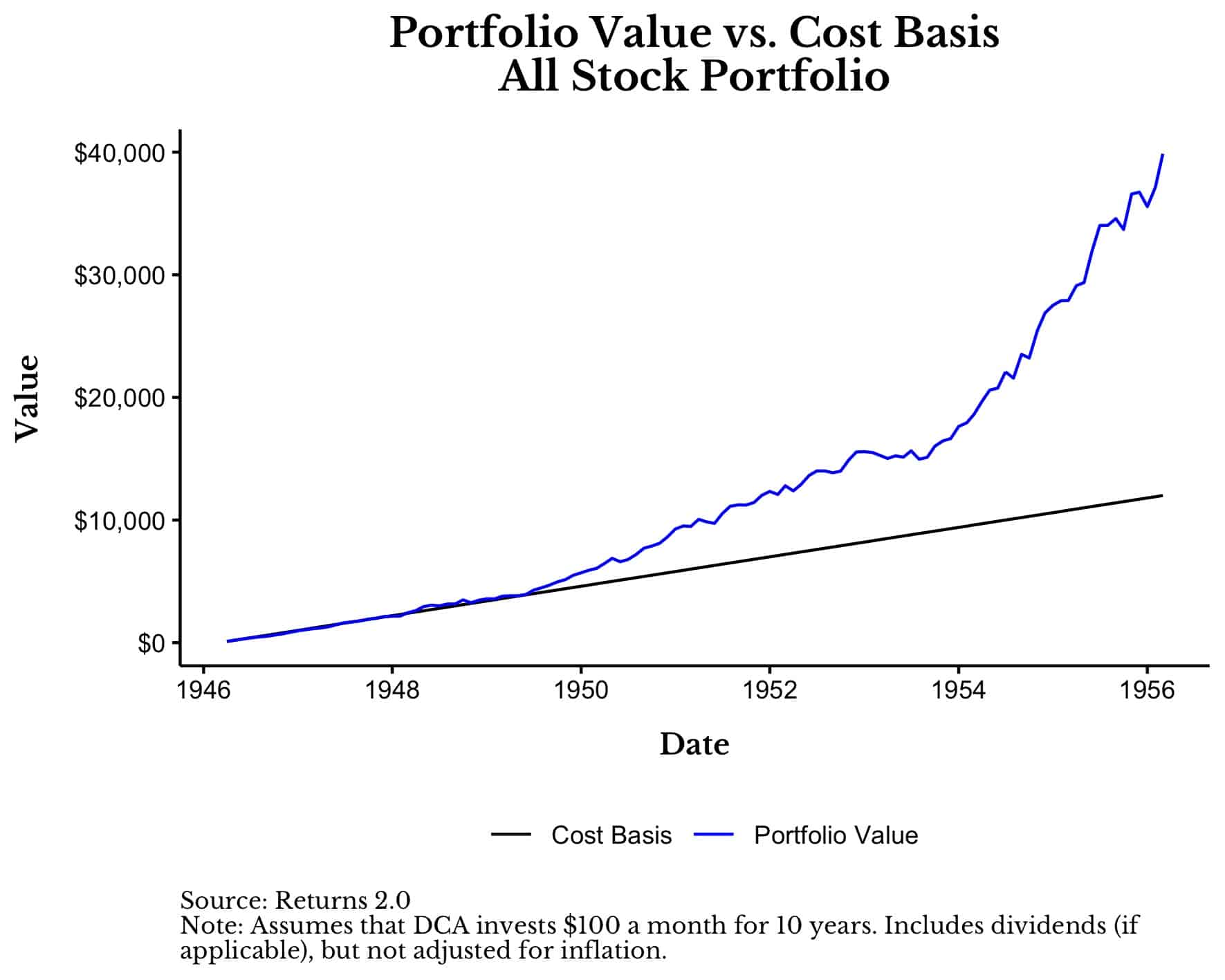
As you can see, a 100% U.S. stock portfolio would have significantly outperformed cash over this time period, being worth 230% more than its cost basis by 1956. In fact, this is the best 10-year period for DCA into U.S. stocks from 1926 through early 2021.
To be fair, had you invested during the worst 10-year period for DCA into U.S. stocks (i.e., March 1999 to February 2009), your $12,000 in contributions would have only been worth about $8,000 by the end of the period:
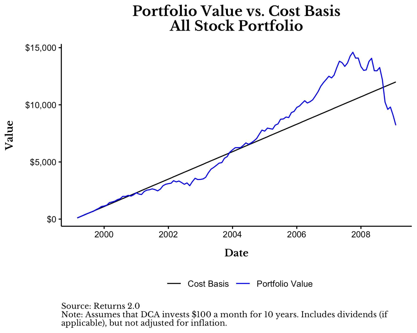
In this case, your final portfolio was worth about 30% less than what you put into it over 10 years. Why? Because this simulation happens to end near the bottom of the Great Financial Crisis (i.e., March 2009).
Now that we have seen the two extremes (DCA winning by 230% and DCA losing by 30%), let’s consider how this strategy would have performed over all periods.
How Did DCA Perform Across All Periods
If we were to look at the total return above (or below) cash for this strategy for each 10-year period from 1926 to 2021 it would look like this:
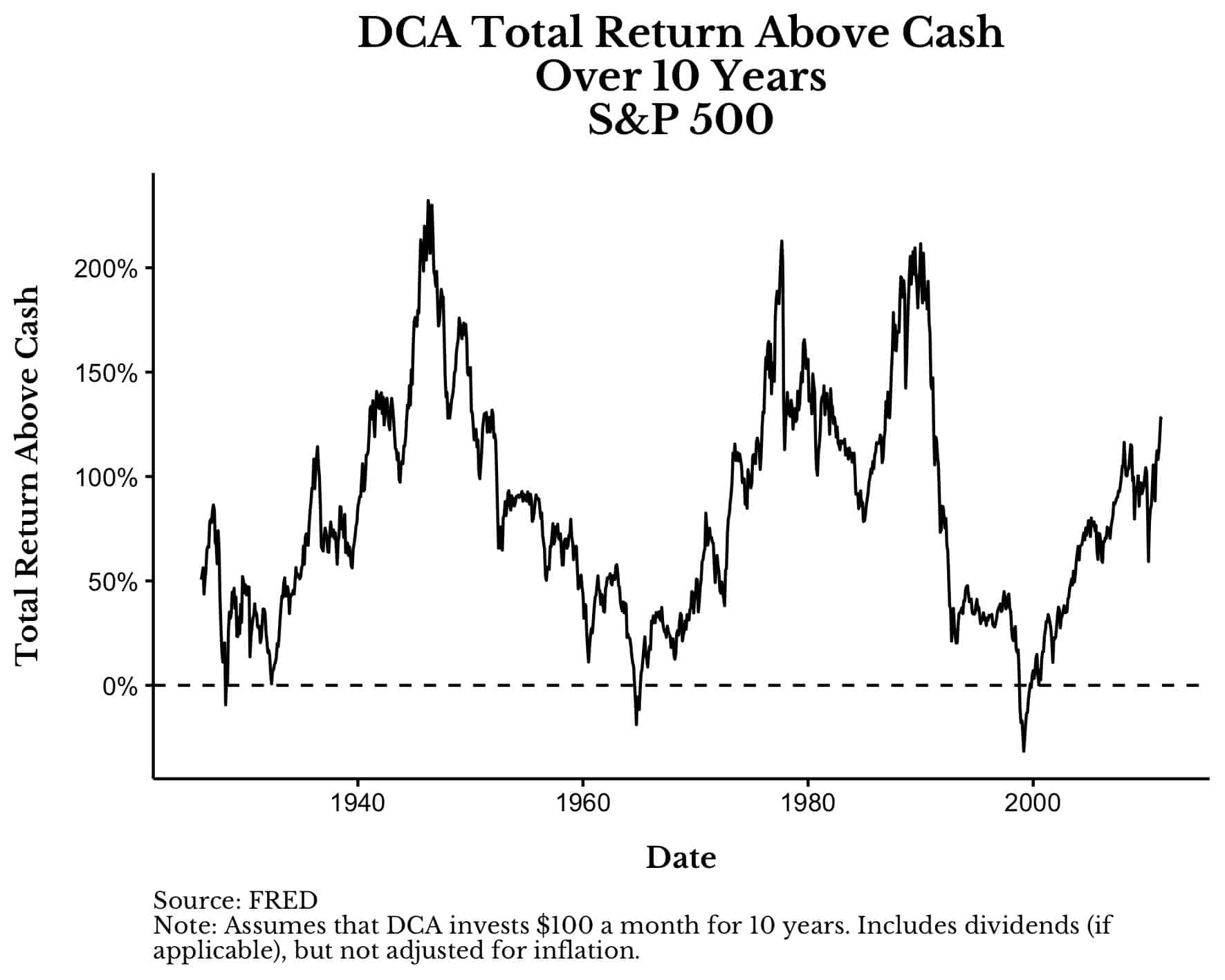
Note that every point on the line above represents one 10-year simulation. So on the far left we have a simulation starting in February 1926 and ending in January 1936, where DCA outperformed cash by about 50% (the final portfolio was worth about 50% more than the $12,000 in contributions). The next point goes from March 1926 to February 1936, and so forth. The low point on this chart is March 1999 and the high point is April 1946 (as discussed previously).
From this graph we can determine how often the line is below 0% (i.e., how often DCA underperforms cash). The answer? 2% of the time. In only about 2% of starting months does DCA into a 100% U.S. stock portfolio underperform cash.
If we were to DCA into 5-Year U.S. Treasury Notes (instead of U.S. stocks) we would find that it underperforms cash 0% of the time. In other words, DCA into 5-Year Treasuries have beaten cash in every 10-year period since 1926.
And when these asset classes win, they both win by decent amounts. The median total return above cash for U.S. stocks is 76% and the median total return above cash for 5-Year Treasuries is 27%. Translating this back into dollars and it means that, on $12,000 in contributions, DCA into U.S. stocks typically ends up with $21,120, while DCA into 5-Year Treasuries typically ends up with $15,240.
If we were to look at the distribution of the total return above cash (for both of these asset classes), we could more easily observe the full range of outcomes:
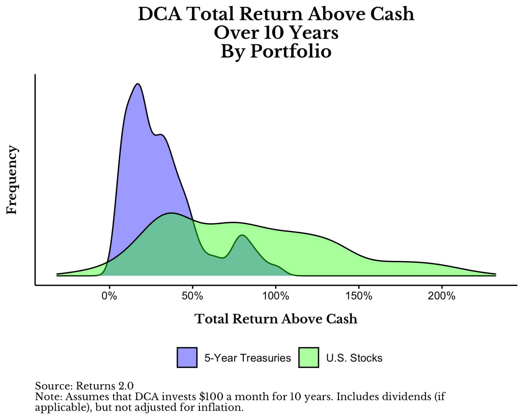
As you can see, DCA into U.S. stocks has a flatter distribution, and thus, a wider range of outcomes than DCA into 5-Year Treasuries. Either way, DCA into both of these assets tends to beat cash by a considerable margin.
Think about the power of this conclusion. If you had picked a random month to start buying U.S. stocks and kept buying for the rest of the decade, there is a 98% chance that you would have beaten cash (and an 83% chance that you beat 5-Year Treasuries as well). Yes, there were times when you underperformed, but in a vast majority of periods you would have made significant gains.
I already know the most common counter argument to this conclusion though:
But Nick, of course this is true for U.S. stocks. They are the outlier of the world. Why don’t you run DCA in a bad stock market and tell me how it does?
Deal. How about we use the poster child of bad stock markets. How about Japan.
What About Japan?
Anytime someone wants to question the validity of an equity investment strategy the most common reply is “what about Japan?” Well guess what? If I do the same exercise above for Japan since 1949, the results are still strong.
Here is a chart of DCA’s total return above cash for a portfolio of 100% Japanese stocks over time:

As you can see, Japan did have a multi-decade period (i.e., 1983-2003) where any sort of DCA into their market would have generally lost you money (relative to cash). But over its entire history, any investor following DCA would have beaten cash 75% of the time with a median total return above cash of 53%.
This means that if you picked a random month to start buying Japanese stocks for the next 10 years, by the end of the period you would have had about $18,360 (on your $12,000 in contributions). Yes, this isn’t as impressive as the U.S., but even Japanese stocks had a 75% win rate over cash over all 10-year periods tested!
If we look at the distribution of the total return above cash for DCA into Japanese and U.S. stocks we can see that Japan’s distribution has a big left tail (negative) relative to U.S. stock performance:
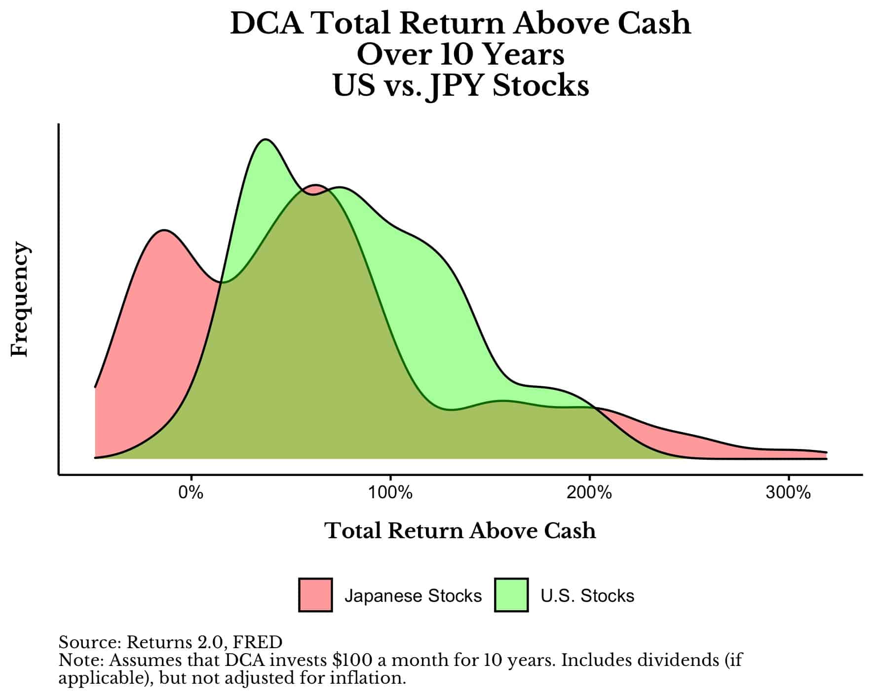
This illustrates that there is a legitimate performance difference between these two asset classes. However, it also illustrates that Japanese stocks didn’t do as badly if you averaged into them over time.
Diversification Makes it Even Better
Lastly, this analysis assumes that your portfolio would have been 100% invested in Japanese stocks (or U.S. stocks) only. But who would put all of their eggs into one basket? I wouldn’t recommend that anyone have 100% of their portfolio in a single asset class, yet many counterarguments rely on this assumption without realizing it.
If you were diversified in any way, you wouldn’t have experience the lost decades for Japan or the U.S. as harshly as what I have illustrated here. For example, the plot below shows the total return above cash for DCA into 5-Year Treasuries, U.S. stocks, and a 60/40 (U.S. stock/5-Year Treasury) portfolio. What you will notice is how the 60/40 portfolio (in red) is a great blend of the U.S. stock and Treasury portfolios because it is better than Treasuries alone, but doesn’t have the same left tail (i.e., bad outcomes) as U.S. stocks:
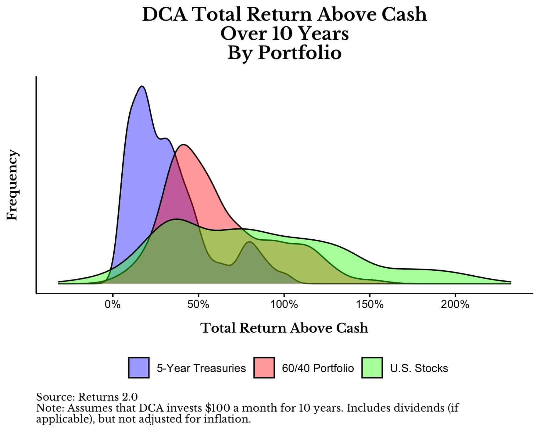
This example illustrates the power of diversification at the asset level in the same way that DCA diversifies you over time. Instead of worrying if you are buying near a peak, just keep buying and you are likely to end up ahead in the long run. This is even true in the worst performing stock markets on Earth, most of the time.
Happy investing and thank you for reading!
If you liked this post, consider signing up for my newsletter.
This is post 248. Any code I have related to this post can be found here with the same numbering: https://github.com/nmaggiulli/of-dollars-and-data