With the market now 30% off its all-time highs, the same question keeps crossing my mind:
How will this crash compare to 2008?
Though the dust from our current crisis hasn’t settled yet, I am already seeing a few key differences in asset behavior that makes the coronavirus crash distinct from the 2008 financial crisis. Besides the speed of this decline (which has already been discussed extensively), asset correlations don’t seem to be following their historical patterns.
For example, during normal times (i.e. times without panic) riskier assets usually have positive return correlations with each other (i.e. their prices move together) and less risky assets also have positive return correlations with each other. However, the risky assets and less risky assets, generally, show little to no return correlation with one another.
This pattern has been generally true for the past few decades.
We can visualize these correlations during normal times using a network plot where each circle is an asset class and the lines connecting the circles represent strong positive (>0.5) or strong negative (<-0.5) correlations in daily returns.
We will color the lines red when the correlations are positive and blue when they are negative, with thicker lines representing stronger correlations (i.e. closer to 1 or -1).
If were to do this during a “normal” time period in markets (i.e. January 2014 – December 2017), it would look like this:
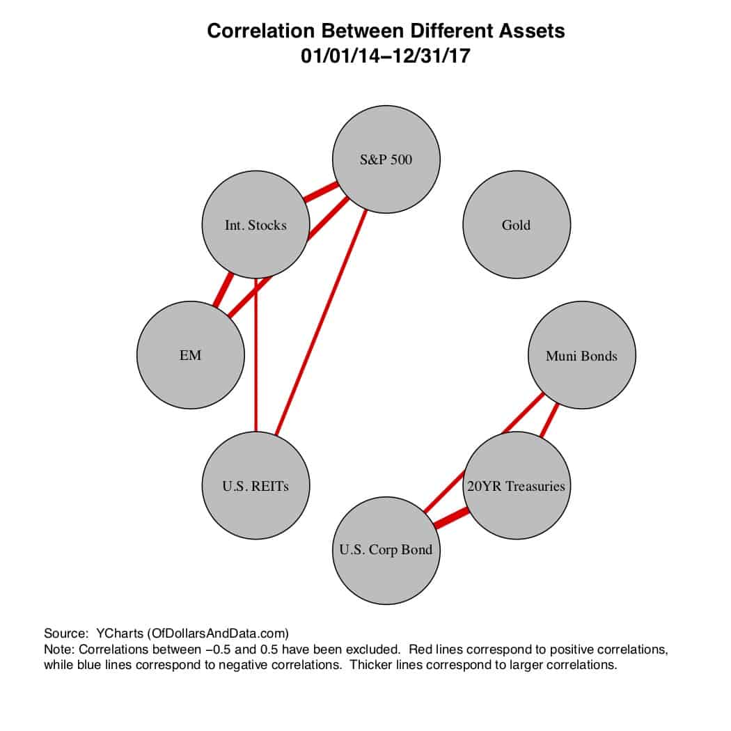 During this time period (2014-2017) there were no major market crisis, and you can see that in the correlations. The risky assets (i.e. stocks and REITs) are positively correlated with each other and the less risky assets (i.e. bonds) are positively correlated with each other, but there is no strong relationship between the risky and less risky asset classes.
However, during times of panic, this changes drastically.
Below is the same network plot as above, except it only shows the two most volatile months of the 2008 crash (September and October):
 Not only do the positive correlations among the risky assets get stronger, but there is also a negative correlation between these risky assets and long term U.S. Treasuries (i.e. the standard less risky asset class).
This is the visual representation of the “flight to safety” that typically happens during financial panics. In an effort to exit their risky positions, investors will sell their risky assets to buy less risky assets.
This is what makes the “correlations go to 1” among risky assets and creates the negative correlation in the plot above. This negative correlation is also one of the reasons why you should consider owning bonds.
However, during the coronavirus crash thus far, the network plot looks a bit different:
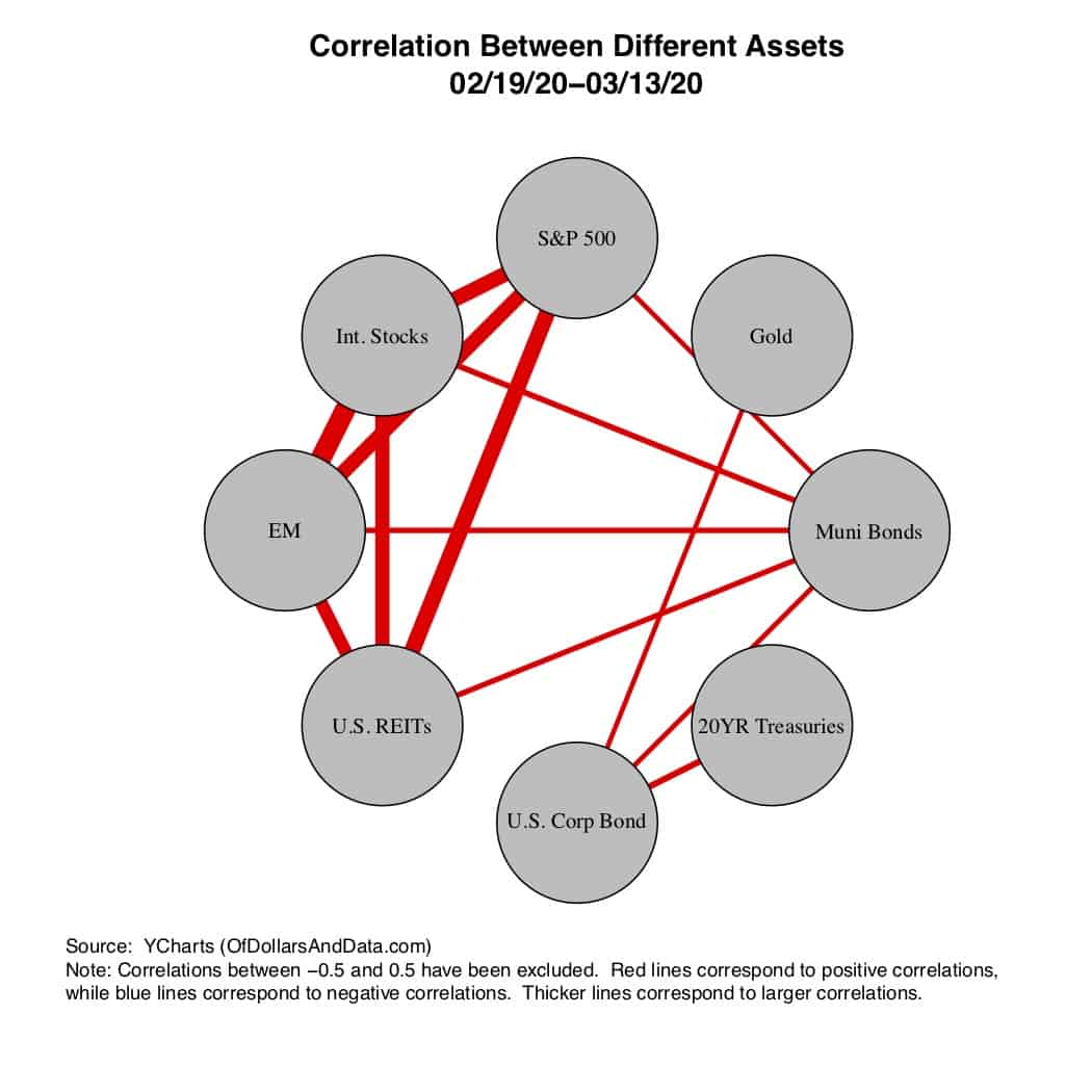 While the correlations between the risky assets are strong (as expected), there is an unexpected positive correlation between the risky assets and U.S. Muni bonds, and no strong negative correlation between the risky assets and U.S. Treasuries.
The lack of negative correlation (i.e. blue lines) in the plot above is what is so concerning about this crisis. However, this lack of correlation is only very recent.
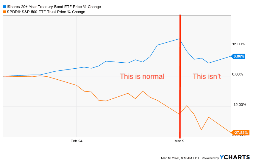
Since the start of the crisis in late February, U.S. Treasuries have been negatively correlated with U.S. Stocks, but last week that pattern broke down:
As you can see, long term Treasury bonds crashed with the S&P 500 last week, which is not the norm.
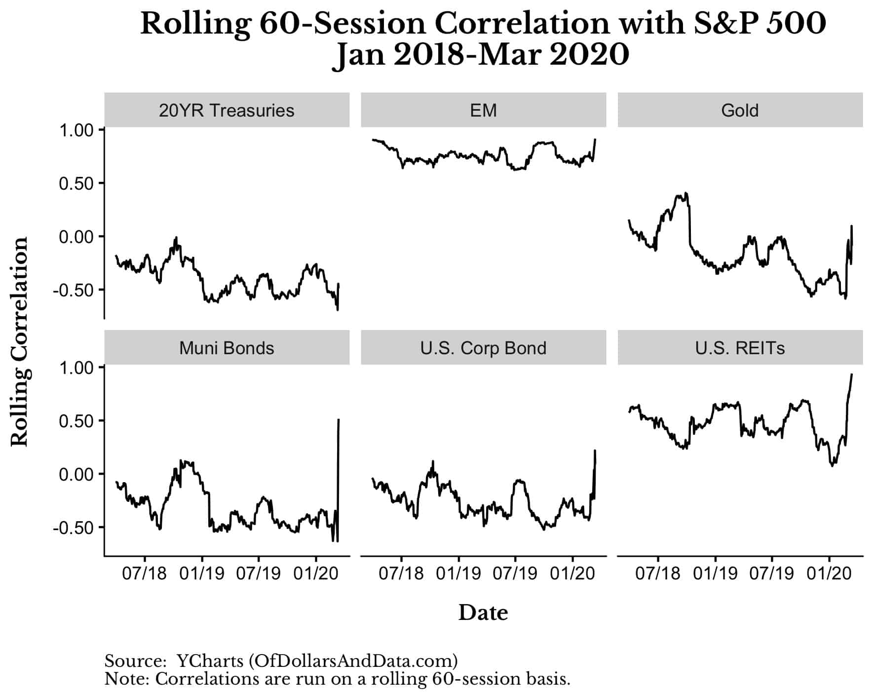
We can see just how different the coronavirus crash is by examining the rolling correlations of daily returns over the prior 60 sessions (i.e. 3 months) between some of these asset classes and the S&P 500:
If you direct your attention to the right side of each of the subplots above, you will notice the spike in the return correlations that happened recently across every asset class. This behavior is expected among risky asset classes (i.e. gold, EM, U.S. REITs), but not for less risky asset classes (i.e. bonds).
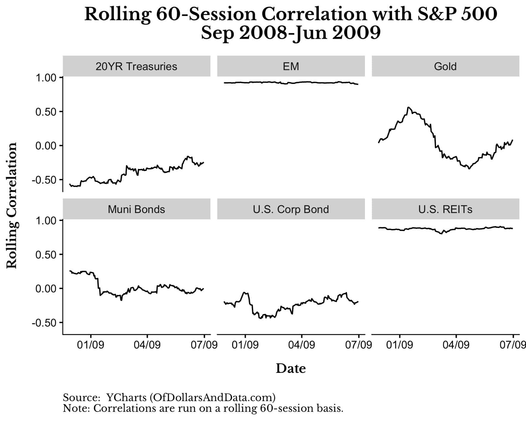
For example, if you look at rolling correlations during the 2008 crisis (i.e. Sept 2008 – June 2009), you see nothing like this in the data:
So, what does it mean when long-term U.S. Treasuries return correlations with the S&P 500 are spiking?
Not 100% sure since we don’t have much data to go on, but it suggests that investors are cashing out entirely. They are forgoing bonds (the traditional safe haven) and moving to cash.
This is why everything seems correlated now. Individual stocks are moving with their stock indices like never before, risky assets are moving together, and even bond assets are now starting to selloff as well.
I don’t have enough data to prove this definitively, but, in the coming weeks, we will be able to determine whether investors are cashing out en masse. Like most things nowadays, we will just have to wait and see what the data tells us.
We’re Not in Kansas Anymore
Yes, the limited data here suggests investors are cashing out, but why?
Maybe some of these investors own a business that is being negatively impacted by coronavirus (i.e. travel, hospitality, etc.) and they are cashing out to cover expenses or lost revenue. Others might be cashing out to hedge against expected job loss or some other adverse outcome.
Unfortunately, the best answer I can give you is: I don’t know.
Sometimes we have to accept that history is no longer a useful guide. We’re not in Kansas anymore.
The fact is that I can crunch all the correlations, produce all the plots, and spawn all the simulations that I want, yet I will be no closer to understanding what comes next.
If you had told me 3 months ago that every restaurant in NYC would be shutdown today, I would have laughed at you. I never would have believed that what is currently happening could ever happen.
Not to us. Not in the 21st century. But, maybe, I have just gotten a little too confident, a little too naive, a little too bullish. It reminds me of an old quote by Friedrich Hayek:
The curious task of economics is to demonstrate to men how little they really know about what they imagine they can design.
Special thanks to Breaking the Market for providing useful comments on this piece, and thank you for reading!
If you liked this post, consider signing up for my newsletter.
This is post 170. Any code I have related to this post can be found here with the same numbering: https://github.com/nmaggiulli/of-dollars-and-data
