One of the most common criticisms I get on this blog is an overemphasis on the U.S. stock market when discussing how investing can make you rich. I will admit that the U.S. has had a more successful investment environment (especially for stocks) than many other countries around the world.
However, global stocks are nothing to be overlooked either. While the U.S. is clearly an outlier on the world stage, most of the strategies I have discussed on this blog can be applied just as well to equity markets around the globe. My goal with this post is to illustrate how a typical global equity investor would have performed over the last few decades in defense of global stocks as an asset class.
Which Countries Will I Examine?
To test this, I have analyzed the returns of 8 different global stock markets (in addition to the U.S.) going back to 1970. These markets were chosen to provide a representative sample of a global equity investor’s experience. The countries chosen can be broken down into three groups:
- The Winners
- These stock markets performed quite well throughout the period tested.
- This group includes the U.S., the UK, China (since 1999), and Canada
- The Laggards
- These stock markets had at least one decade (if not more) of very poor performance with other periods of good performance.
- This group includes Spain, Italy, Japan, and Russia (since 1999)
- The Catastrophic
- These stock markets were destroyers of wealth.
- This group includes Greece (since 1999).
Now that you have an idea of what kind of performance to expect from each country, let’s look at how they actually performed.
How Did Global Stocks Perform?
To test the performance of these stock markets, I simulated what would have happened if you invested $100 a month into each of these markets for 10 years. I then do this for every 10-year period possible in the data for each country. This is identical to what I did last week in my post on how often dollar cost averaging fails.
If we were to look at the rolling performance (i.e., the return above cash) for this strategy across all these equity markets over time, it would look something like this:
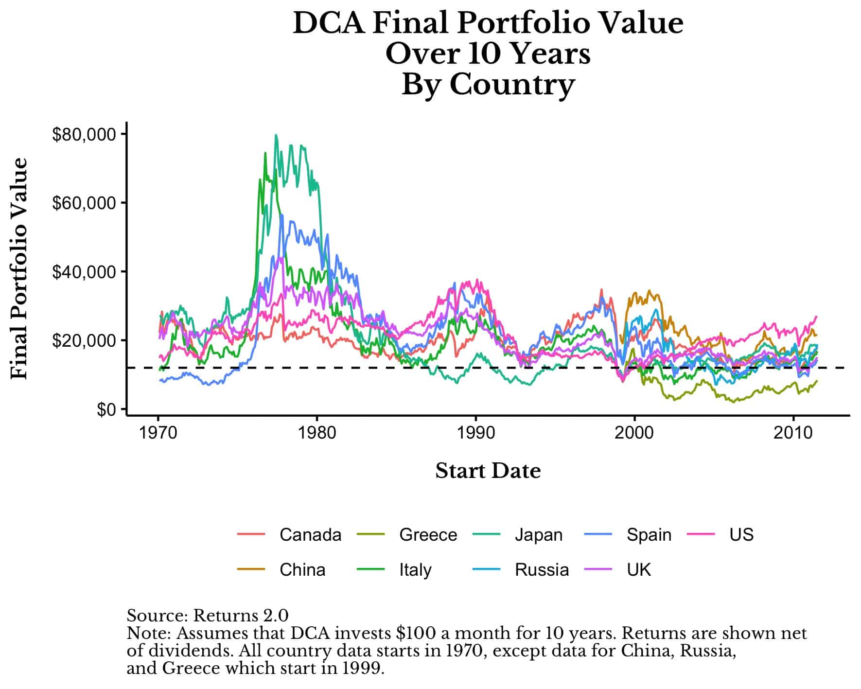
Every point above represents the final portfolio value after investing $100 a month for 10 years into the specified country starting at the start date listed. For example, if you had started investing $100 a month in 1977 into the Japanese stock market, after 10 years you would have had nearly $80,000 despite only making $12,000 in contributions. This is represented by the highest point in the chart above (in the aqua green color).
In addition, I have included a dashed horizontal line to represent what would have happened if you held this money in cash ($12,000) instead of investing it over the decade. You can think of this horizontal line as the breakeven point on your investment.
As you can see, most global stock markets would have increased your wealth most of the time. The primary exceptions to this are Spain in the 1970s, Japan in the mid-1980s to mid-1990s, and a handful of countries in 1999 and after the year 2000. The worst performing market in the group is clearly Greece, which destroyed wealth at a rapid clip starting in the early 2000s onward.
How bad was Greece? If you were unfortunate enough to invest in Greek stocks from 2006 to 2016, your $12,000 in contributions would have turned into roughly $2,000 by the end of the decade (about 85% less wealth than holding cash). If you run this through a financial calculator, it would have been equivalent to earning -60% on your money for a decade. That’s about as bad as it gets.
Now compare this to Japan from 1977 to 1987. If you had invested $100 a month, you would have had nearly $80,000 by the end (or 566% more wealth than holding cash), which is equivalent to earning roughly 30% per year on your money. This is about as good as it gets.
But those are just the extremes. If we look at the return above (or below) cash over time, we can see the wide range of outcomes that exist. The plot below shows the percentage of simulations where a particular country had a total return below cash, a 0-50% return above cash, or a greater than 50% return above cash after investing for 10 years:
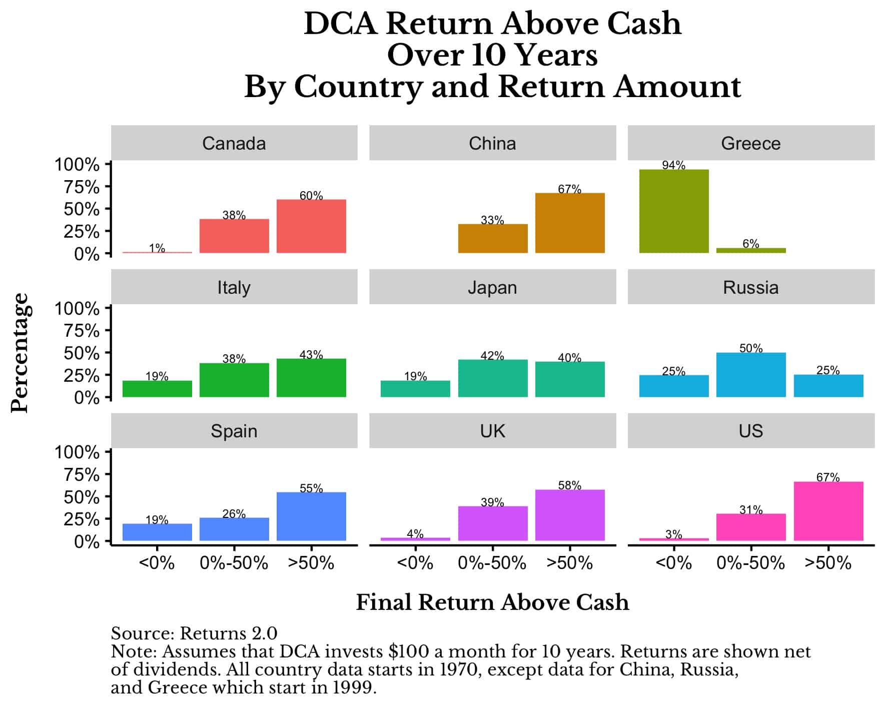
As you can see, Canada, China, the UK, and the US are all the Winner stock markets that have had very few periods where their markets didn’t beat cash after 10 years. Compare this to the Laggard markets of Italy, Japan, Russia, and Spain who have had far more periods where they underperformed cash. Lastly, Greece’s performance is in a class all of its own with 94% of its 10-year periods since 1999 having a total return below cash.
Now that we have looked at the variance in country returns, let’s turn our attention to what a global stock investor could have expected throughout history.
What is the Most Likely Outcome?
Instead of examining the results by country, let’s now analyze all 10-year simulations together. If you picked one of these simulations at random, what kind of performance could you expect? Of the 3,438 country-decade combinations in the data, you would have beaten cash in 85% of them. Additionally, the median outcome would mean turning your $12,000 in contributions into $18,000 (50% more) after 10 years of investing $100 a month. This equates to an 8% annualized return on your money. Not bad.
In the 25th percentile outcome, your money would have compounded at about 3% a year, and at the 75th percentile outcome your money would have compounded at 13% a year. This means that there is a 25% chance of making less than 3% annually in some global stock market and a 25% chance of making over 13% a year as well.
Unfortunately, this analysis isn’t applicable to most retail investors because it assumes that you invest all of your money into a single stock market. There is no diversification. However, if you were to diversify across global equity markets, your chance of experiencing a negative outcome would drop significantly.
For example, if you had invested $100 a month for 10 years into an equal-weighted portfolio of stocks from Canada, Italy, Japan, Spain, the UK, and the U.S. since 1970, your chance of beating cash would have been 96% across all 10-year periods examined. This is a bit higher than the 85% expectation of beating cash when investing in a single market.
More importantly, the 25th percentile outcome is also better as well. Instead of compounding your money at 3% if you invested in one country’s stock market, you would compound your money at 4.6% per year with the equal weighted portfolio.
Of course, using the equal-weighted portfolio comes at a cost. When doing so, the median outcome decreases from an expected return of 8% per year (when investing in a single country’s stock market) to 7% per year (for the equal-weighted portfolio). For any diversified equity investor, this seems like a pretty good tradeoff.
Now that we have thoroughly examined a sampling of global equity returns, we can see that stocks (historically) have provided decent growth to investors across the globe. Of course, the U.S. has been an outlier among this group, but there is a real possibility that it won’t be in the future. If so, as I have demonstrated above, global equities should be able to pick up the slack.
Until then…happy investing and thank you for reading!
If you liked this post, consider signing up for my newsletter.
This is post 249. Any code I have related to this post can be found here with the same numbering: https://github.com/nmaggiulli/of-dollars-and-data