


Over the past few weeks I have discussed how the coronavirus crash is different from prior market crises. However, there is one thing that this market decline shares in common with every other panic in financial history–a mass movement to cash.
For example, CNBC recently reported that money market mutual fund assets reached their highest levels since March 2010, led by a retail investor exodus out of risk assets.
There have been record outflows among high-grade bond funds and Eric Balchunas recently tweeted a chart of monthly mutual fund flows demonstrating the exact same thing:
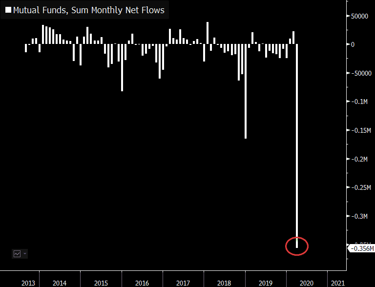
It looks like in March 2020, the flight to safety was in full effect.
But what does this mean going forward? Are high investor allocations to cash bullish or bearish?
To answer this question, I will be relying on the American Association of Individual Investors (AAII) Asset Allocation survey. Their survey data provides a snapshot of how AAII’s members are allocated across stocks, bonds, and cash each month since 1987.
Following the extreme volatility last month, I was anxious to get my hands on the March 2020 AAII survey data. Thankfully, it didn’t disappoint. Below is a chart of the percentage of assets that survey respondents have held in cash over time:
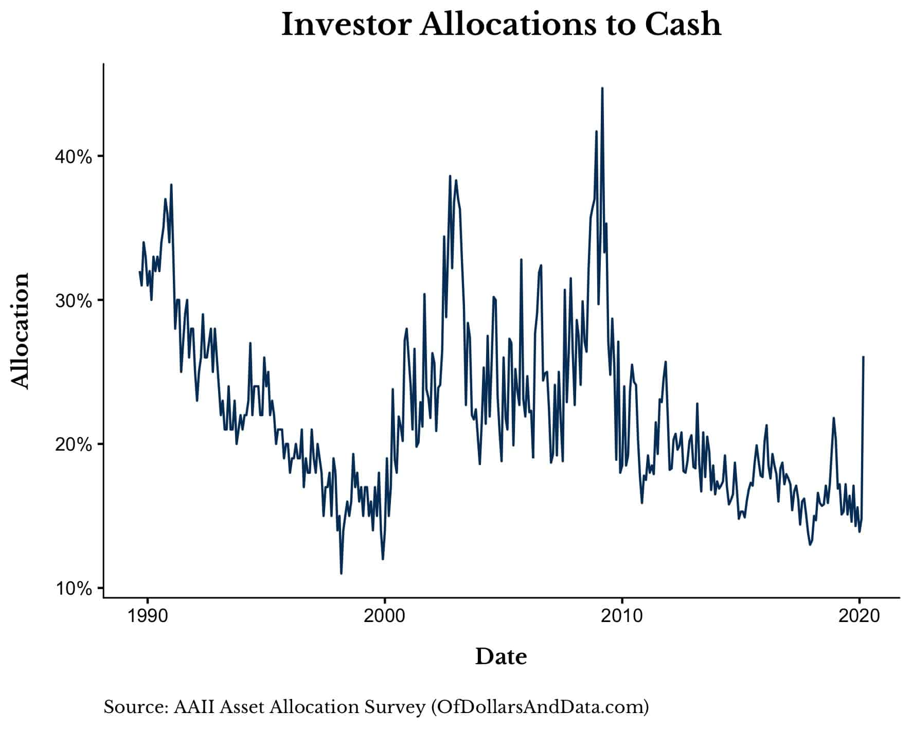
As you can see, March 2020 saw a huge move to cash among investors relative to recent years. However, the aggregate cash holdings are nowhere near the levels seen during the GFC or the end of the DotCom bubble.
Does this suggest that we may have more to go? Who knows.
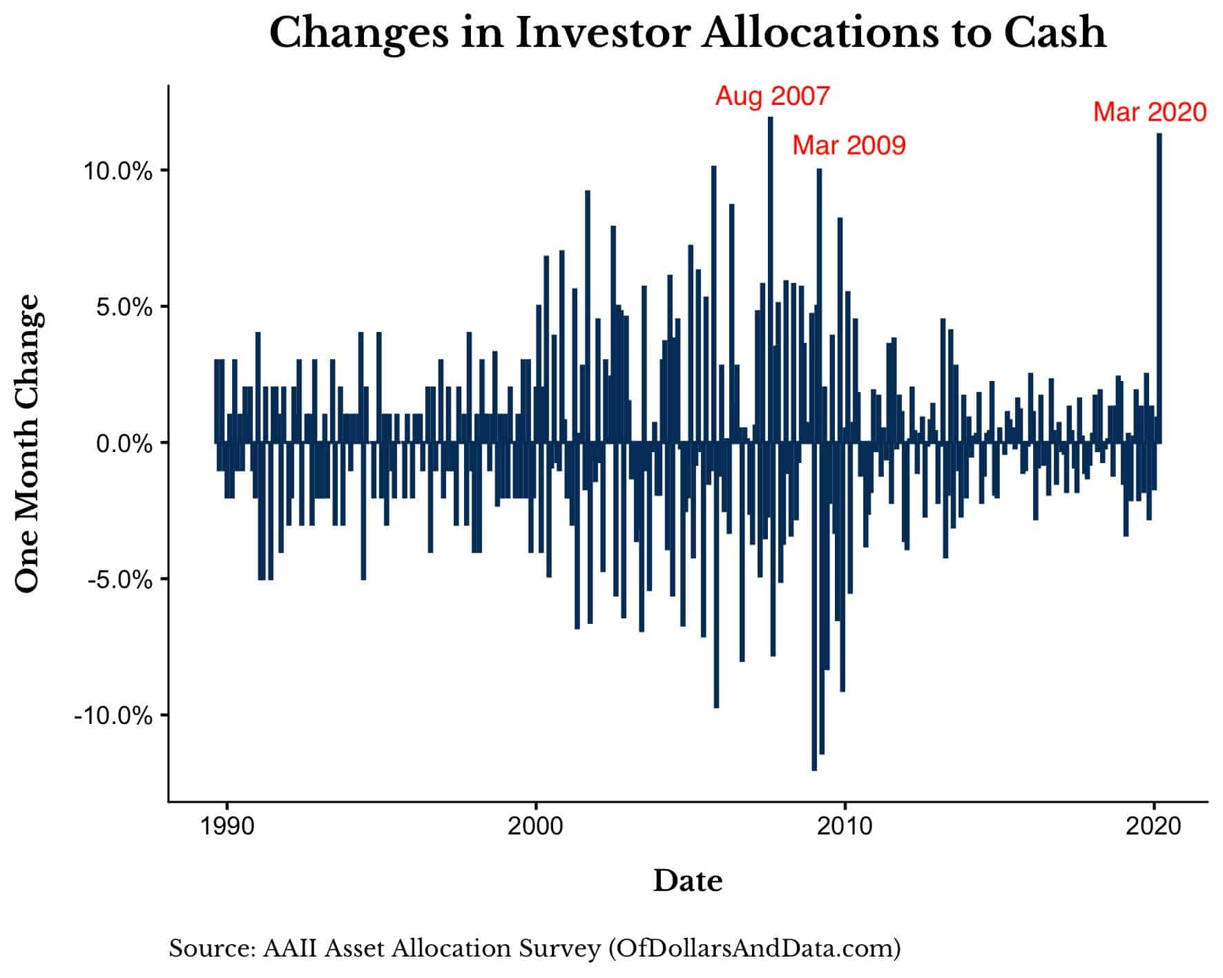
What is more telling is that March 2020 was the 2nd largest one-month change in aggregate cash holdings in AAII survey history. The largest one-month change occurred during the quant quake of August 2007:
After seeing this you might be wondering whether this data is meaningful. Do higher (or lower) cash allocations correlate with higher (or lower) future returns?
Well, it depends on the time scale. Aggregate investor cash holdings seem to have little correlation with returns over the next 1 year:
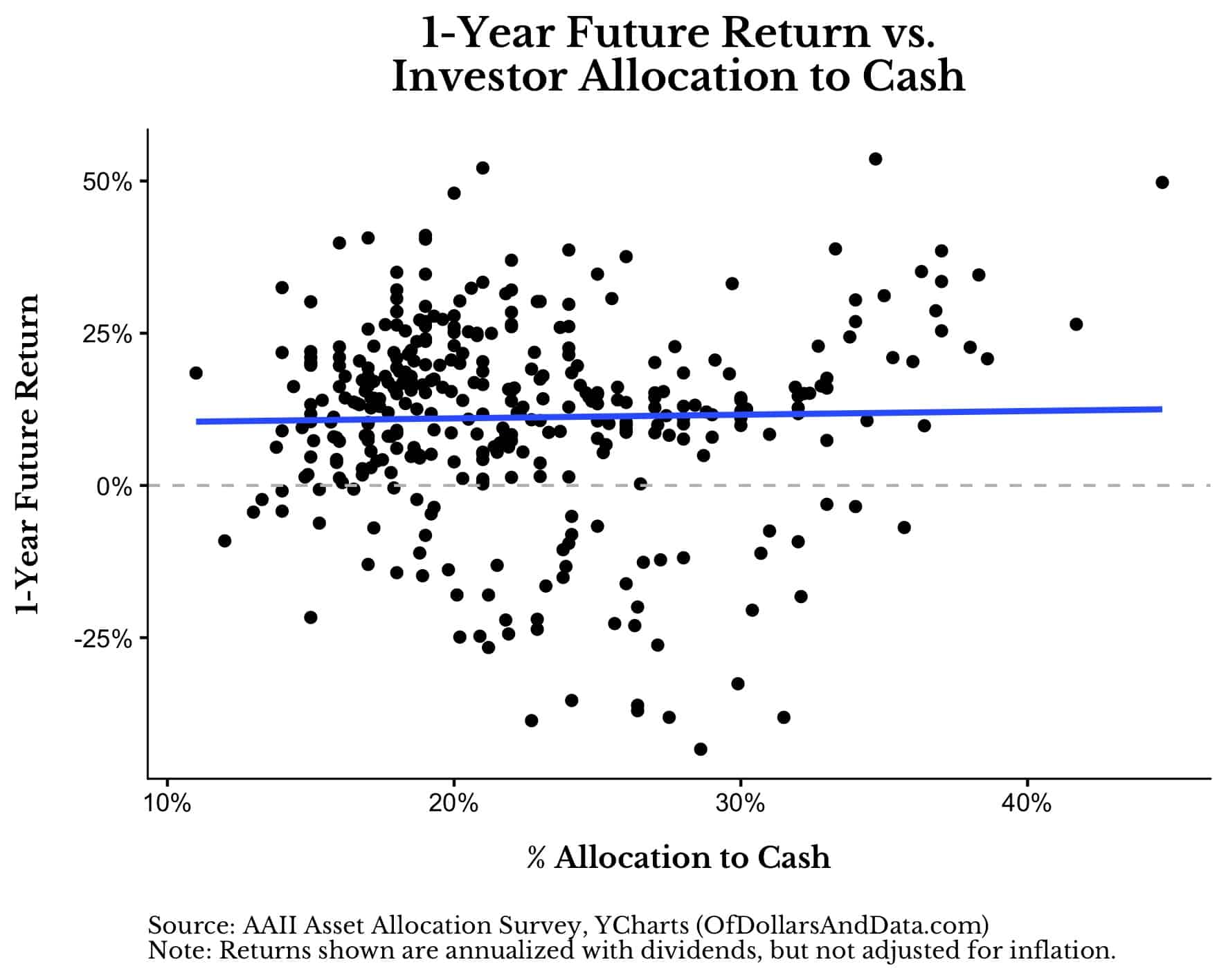
As you can see, while very high levels of cash are generally followed by positive returns, this analysis has sample size issues and many overlapping return periods (i.e. remember each dot is one month).
Despite these limitations, if we look at investor cash holdings and returns over the next 10 years, a more positive relationship emerges (note: all returns are annualized):
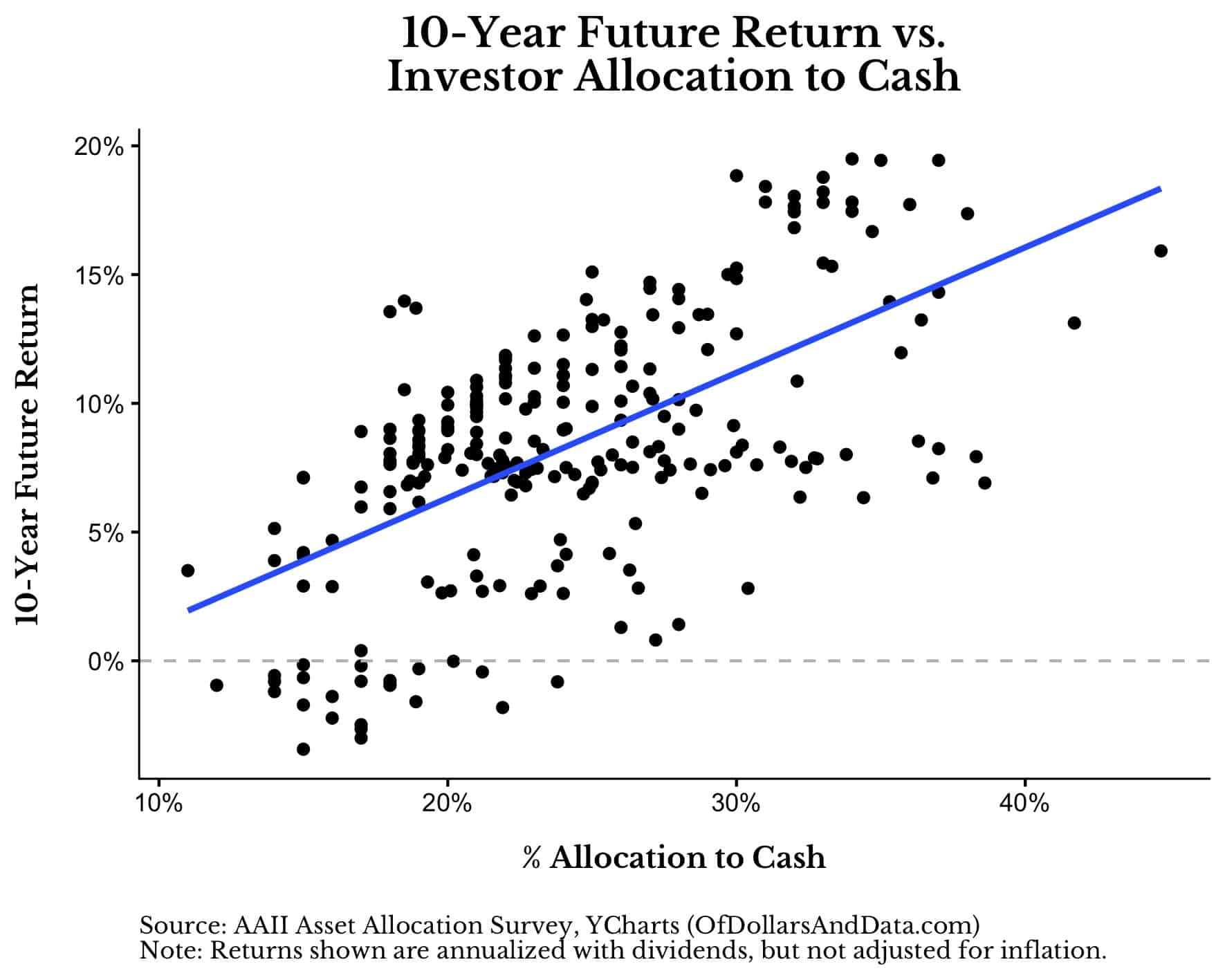
This chart suggests that higher allocations to cash correspond with higher future returns, all else equal.
Why is this true?
It’s true because if we look at how survey respondents were allocated to stocks, bonds, and cash since 1987, we can see that the highest allocations to cash occurred near stock market bottoms (i.e. 2003, 2009):
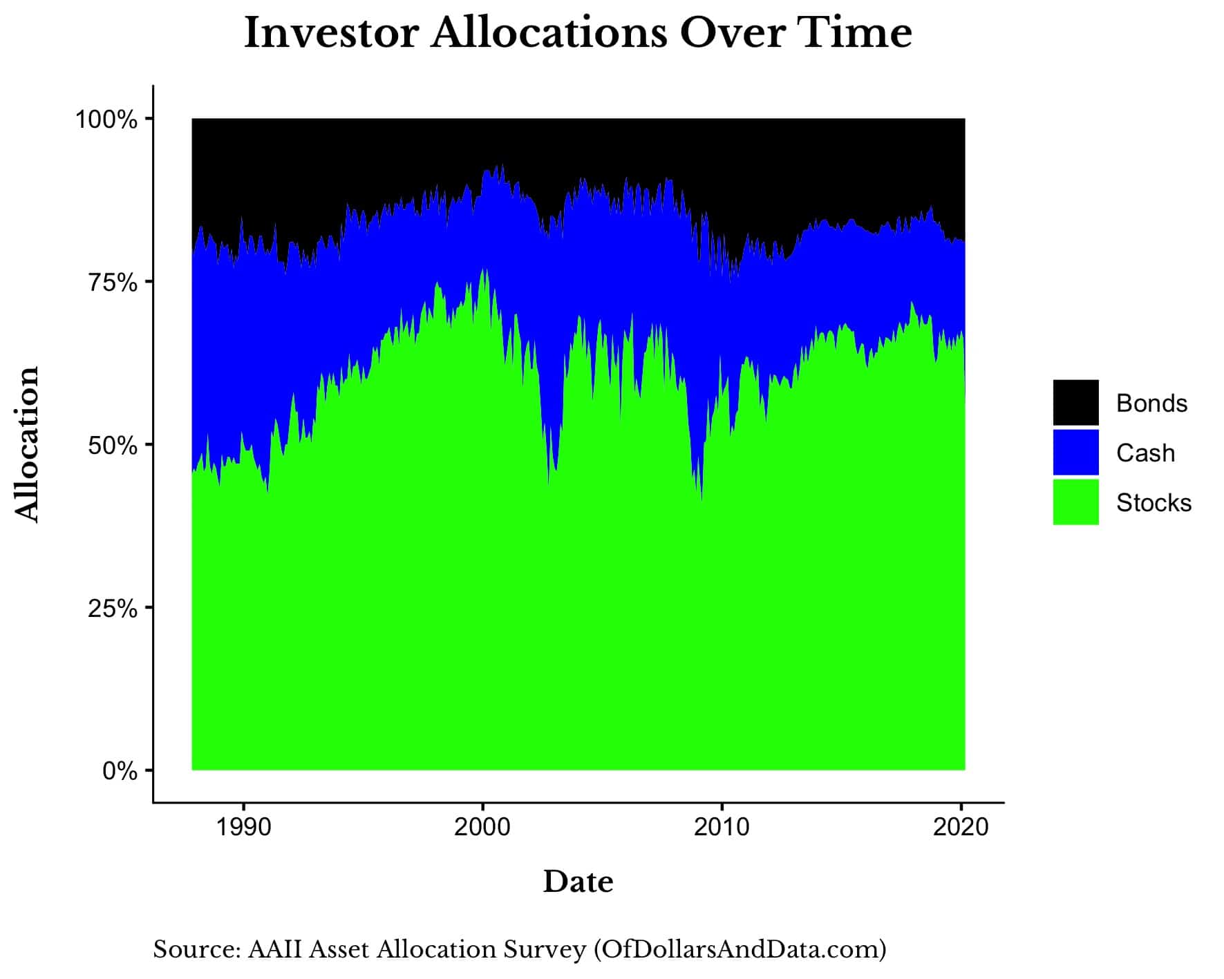
This makes logical sense as any investor who did not change their allocations in any way would be holding more cash and bonds following a decline in equities.
As an example, imagine you have a $100 portfolio with $60 in stocks, $30 in bonds, and $10 in cash. If stocks decline by 50% and nothing else has changed, you now have $30 in stocks, $30 in bonds, and $10 in cash.
Your portfolio went from having 60% allocated to stocks ($60/$100) to having 43% allocated to stocks ($30/$70) without any buying or selling on your part. This is why cash allocations (by definition) increase during periods where equities are depressed.
And it is precisely when equities are depressed and allocations to stocks are low that future returns are the greatest (assuming the market recovers).
With that being said, where are we today? Currently AAII investors have 55% of their portfolios allocated to stocks (i.e. the dotted line in the plot below):

As you can see, stock allocations hit these levels usually only during times of crisis, at least over the past few decades.
To demonstrate this, below is a plot of the growth of $1 in the S&P 500 (with dividends) and all those periods where AAII investor allocations to stocks were less than 55%:
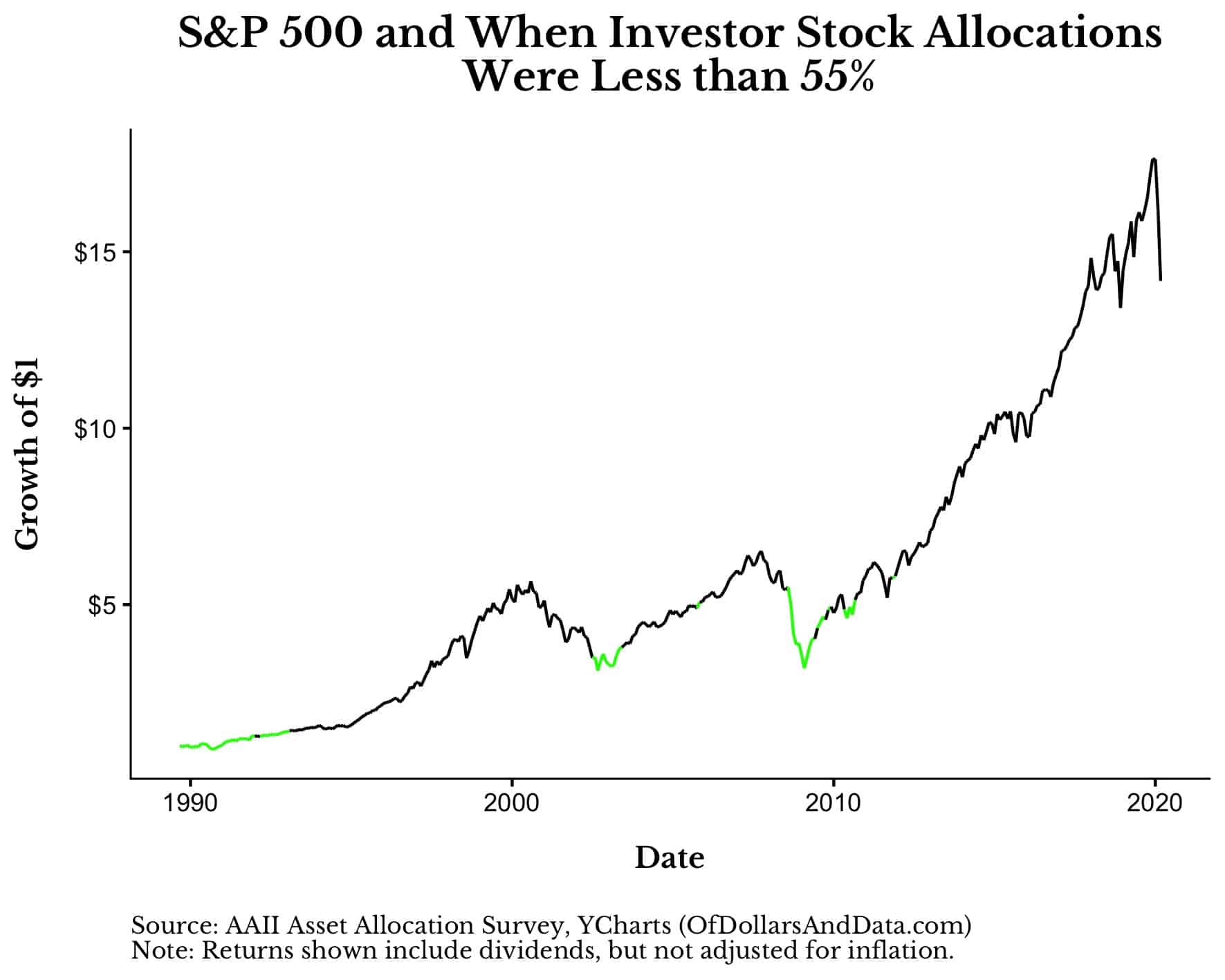
Based on this alone, I would agree with the data that lower stock allocations (and higher cash allocations) are generally a bullish signal for equities over the long-term.
Then again, if we take out all overlapping time periods, N = 3. It’s not much to go on, but it seems to be a decently reliable indicator. So while things may not look good right now, they are likely to look good much later.
Too Many Signals
At this point you are probably overwhelmed with the number of different signals “suggesting” whether markets are bullish or bearish.
On one hand, a high VIX, the mathematics of returns during a crisis, and the aggregate investor allocation to cash, suggest that you should be bullish.
On the other hand, Fed rate cuts and the average length of a bear market being 14 months, suggest that you should be bearish.
We can play this game all day and we will still be no closer to knowing how the future will unfold. This is what makes historical data analysis intriguing, but not necessarily profitable.
If it were that easy, then everyone would be investors and would have no problem with 20%, 30%, or 50% declines in equities.
But it isn’t that easy. Investing is a game of hope, pain, fear, greed, and so much more.
That’s why when my friend texted me in panic last month asking for reassurance that, “Investing works…right?” I had to respond with, “Yes, but things may get a lot worse.”
I don’t believe in many absolutes, but I do believe in the long term growth of global capital markets. It’s the only signal I will ever need.
Thank you for reading!
If you liked this post, consider signing up for my newsletter.
This is post 176. Any code I have related to this post can be found here with the same numbering: https://github.com/nmaggiulli/of-dollars-and-data