In one of my favorite animal experiments, researchers wanted to see how pond cichlids would change their mating behavior as the sex ratio (number of males relative to females) was altered in a controlled environment. Since cichlids are known for their monogamy and don’t desert their partners often, the zoologists thought that small changes to the sex ratio wouldn’t have a large impact on cichlid mating behavior.
Jon Birger summarizes what the experimenters found in Date-onomics: How Dating Became a Lopsided Numbers Game:
Increasing the ratio of male cichlids to females from 6:6 to 7:5 cut the male desertion rate in half—from 22 percent to 11 percent. It also rendered females choosier about males and made the successful male suitors more protective of their females.
The end result was a kind of underwater patriarchy—one in which male cichlids fought each other for access to mates, jealously guarded their females after mating, and…made greater investments in parenting (be it through direct parenting effort or via the providing of resources such as food or protection).
When there were more males than females, females had more relative “market power” and were able to get more commitment and parenting resources from their mates. However, when the experimenters ran the reverse experiment, altering the ratios of males to females to 5:7, this all changed.
With more females relative to males, the male desertion rate skyrocketed to 51% and many of the male cichlids took on multiple female mates. The “market power” reversed and the males got the upper hand.
You might think that this behavior is isolated to cichlids and other animals, but Birger found the same pattern in human mating after examining the sex ratios of different dating markets across the U.S.
As the theory predicts, those areas with more females (relative to males) had a higher percentage of short-term dating encounters and those with more males (relative to females) had more relationships and committed men. This was true whether you examined a big city, a small town, or a college/university.
Birger’s work illustrates how markets, even those as complex as dating markets, can be partially determined by one of the simplest idea in economics—supply and demand. While you might think this is far-fetched, the basic forces of supply and demand are also one of the best predictors of future stock market returns.
In particular, when average investor allocation to stocks is high, returns for the next 10 years are low, and when average investor allocation to stocks is low, returns for the next 10 years are high. Using survey data from the American Association of Individual Investors, we can see the negative relationship between average investor allocation to equities (“AvgEquityShare”) and future returns clearly:
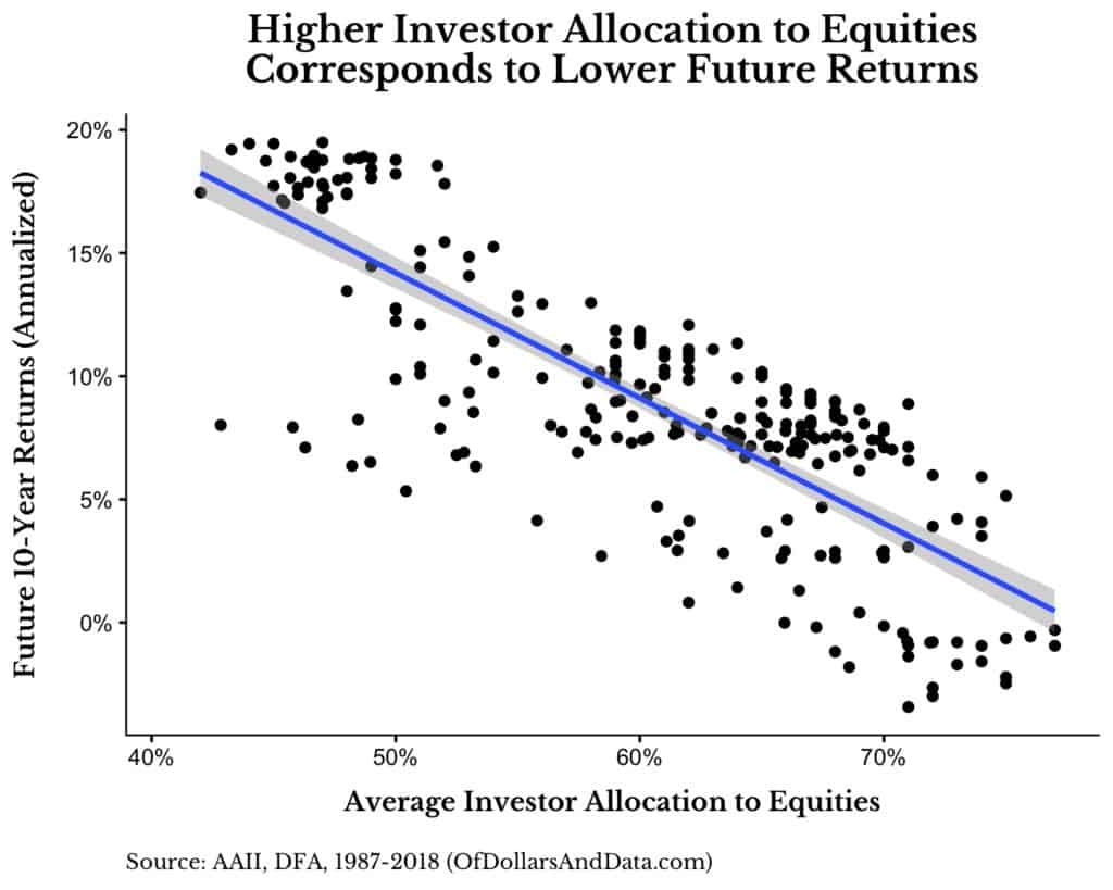
As you can see, when AvgEquityShare is higher future returns are lower and vice versa. Anecdotally this idea makes sense. For example, BusinessWeek’s “The Death of Equities” issue came out in 1979, the year before the best back-to-back decades in U.S. stock market history, while the DotCom bubble was the point of maximum stock demand right before a decade of low returns.
I originally came across this idea in an incredible post from the blogger Jesse Livermore (pseudonym) in December 2013. Jesse’s post is far more technical and in-depth than what I have time to cover here, but it illustrates how AvgEquityShare is far more predictive of future stock market returns than many traditional valuation metrics.
[Quick aside: Though the AAII data I use does not include bank holdings, which is an important and critical difference from Jesse’s method, I still think we find similar conclusions.]
With that being said, though the AvgEquityShare model outperforms “Buy and Hold”, I will also show how it is useless for a typical investor. To start, here is how the AvgEquityShare model works:
- Start by investing in stocks (S&P 500).
- When demand gets too high (>70% average equity allocation) => sell your stocks and move into bonds (5yr Treasuries).
- Stay in bonds until demand gets too low (<50% average equity allocation) => sell your bonds and buy back into stocks.
- Repeat steps 2-3.
That’s it. I chose the 70% upper limit and 50% lower limit to have round numbers that also corresponded to different return regimes (aka I data-mined this using backtests).
If you run this model you will find that from 1987 to 2018, $1 would have grown into $43 compared to only $24 for “Buy and Hold” (almost 2x better dollar growth), with a far better drawdown profile: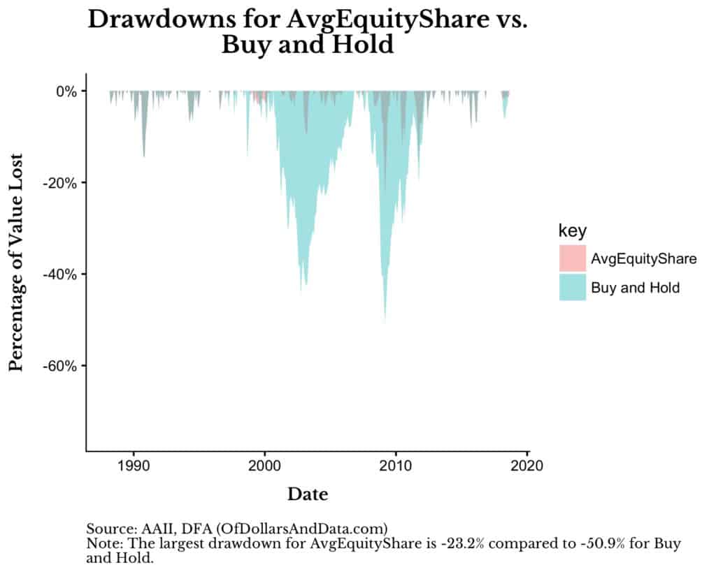
As you can see, the worst loss you could have experienced for the AvgEquityShare model is half (-23.2%) of what “Buy and Hold” delivered (-50.9%). Though I could show you many other performance metrics that illustrate how much better the AvgEquityShare is than “Buy and Hold” it wouldn’t matter. Why?
Because when we dig into the details we realize that the AvgEquityShare model would’ve been near impossible to hold for any typical investor.
As an example, consider how the AvgEquityShare (orange line) performed compared to “Buy and Hold” (teal line) during the DotCom bubble:
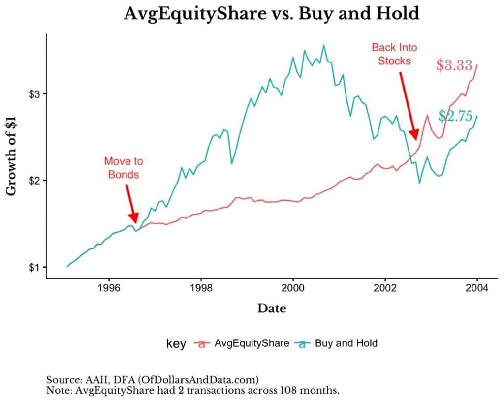
As you can see, the model moved to bonds in September 1996 and didn’t get back into stocks until October 2002! Though it outperformed in the end, at what psychological cost?
Can you imagine how hard it would be to sit in bonds for 4 years while your friends (some of them dumber than you) got rich along the way? It would be near impossible. The same thing happened in the GFC when this model signaled to get out of stocks in May 2006 and get back in during November 2008.
Yes, this also outperformed “Buy and Hold” over that period, but who could’ve waited it out?
The Hardest Discipline
Even when we have reasonable evidence that a particular investment strategy will work, the hardest discipline is sticking to that strategy through thick and thin. It is so difficult because that little voice in your head says, “What if this signal doesn’t work anymore? What if it was just a data-mined result? What if I’m wrong?”
That little doubt is all it takes to turn the hardest resolve into the emotional putty that has destroyed generations of investors.
With that being said, I am going to issue a warning on what I am about to say. I do not recommend you changing your investment strategy based on the following information:
- The AAII AvgEquityShare model I discussed above sold out of stocks in January 2018 after being fully invested every single month since November 2008.
This happened because the AvgEquityShare got above 70%. It currently (as of September 2018) stands at 69.88%. Does this mean that a crash is coming? Maybe. Or maybe in a few years. Or maybe the model doesn’t hold anymore. If you think there is some chance this model is right and you want to see the data source, I will provide the phrase found in Dante’s famed inferno:
Abandon hope all ye who enter here.
I can only show you the door. You are the one that has to walk through it. Thank you for reading!
If you liked this post, consider signing up for my newsletter.
This is post 93. Any code I have related to this post can be found here with the same numbering: https://github.com/nmaggiulli/of-dollars-and-data