I have a bone to pick with investment bloggers, myself included. We all like to discuss historical returns in a way that isn’t all that practical. We might say something like, “If you had bought the S&P 500 on January 1, 1980 and held for 30 years then …”
But, this kind of analysis is imaginary. Even putting aside the difficulty of practicing buy and hold, very few people invest like this.
Yes, analyzing market returns from a specific point in time can be effective for demonstrating the power of compounding. However, these “snapshot-based” analyses don’t correspond to the experience that most investors have in the markets.
Most people (you and I included) don’t buy once and wait to retire. Unless we get a large windfall, we will purchase assets slowly over time.
We will accumulate these assets during our working years and gradually sell them off during our golden years. If you invest like this (which you most likely do) then you will think quite differently about markets.
For example, the Japanese stock market is the poster child for equity bubbles and markets that don’t recover. This reputation is true, if you had invested all of your money at the market peak in 1989.
However, if you had starting buying monthly (i.e dollar-cost averaging) in 1980 and never stopped, the post-1989 decline is far less pronounced [Note: The dotted line in the plot below represents your monthly contributions into the Japanese equity market while the solid line is your current portfolio value]:
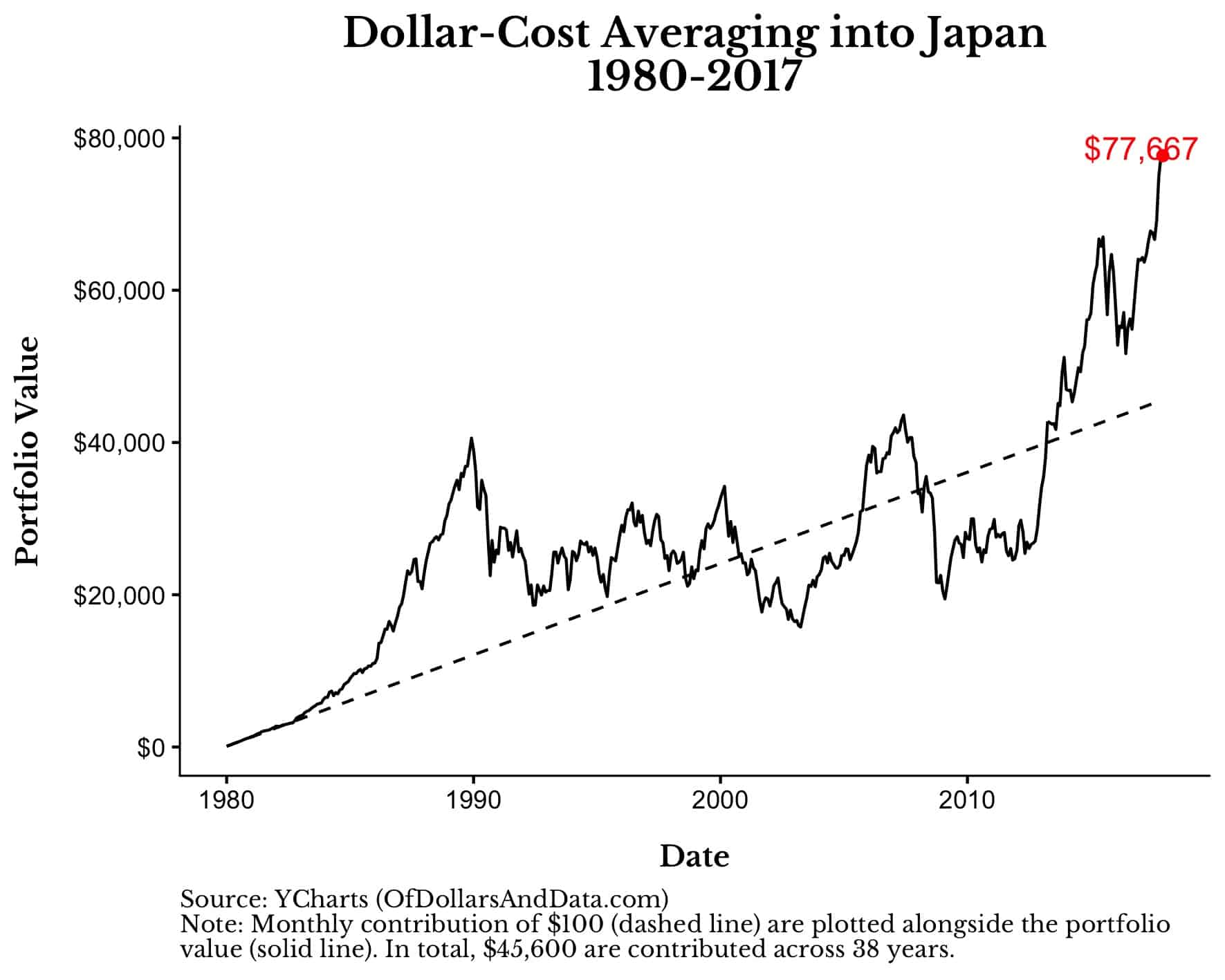
As you can see, there are times when the solid line (portfolio) is below the dashed line (contributions), but for those investors that held on and kept contributing, their experience improved with time.
This is the difference between taking a snapshot approach and an approach that reflects an investor’s actual experience.
With this framework in mind, what would it have been like for a hypothetical U.S. investor who bought into the market during different periods in market history?
To illustrate this, I ran a simulation where an investor puts $1,000 a year into a portfolio of either (100% U.S. stocks, 60% U.S. stocks + 40% U.S. bonds, or 100% U.S. bonds) and rebalances annually.
The $1,000 contribution is adjusted for inflation so that each year they are investing the same real purchasing power.
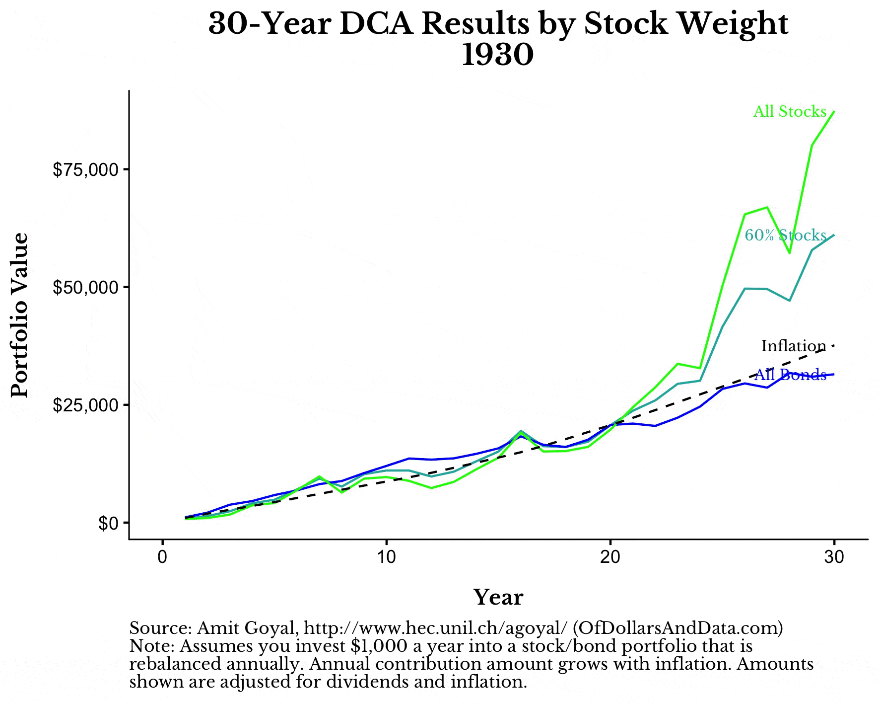
For example, for the 30-year period starting in 1980 and ending in 2010, here is how an investor buying in annually (i.e. dollar-cost averaging or “DCA”) would have done compared to inflation:
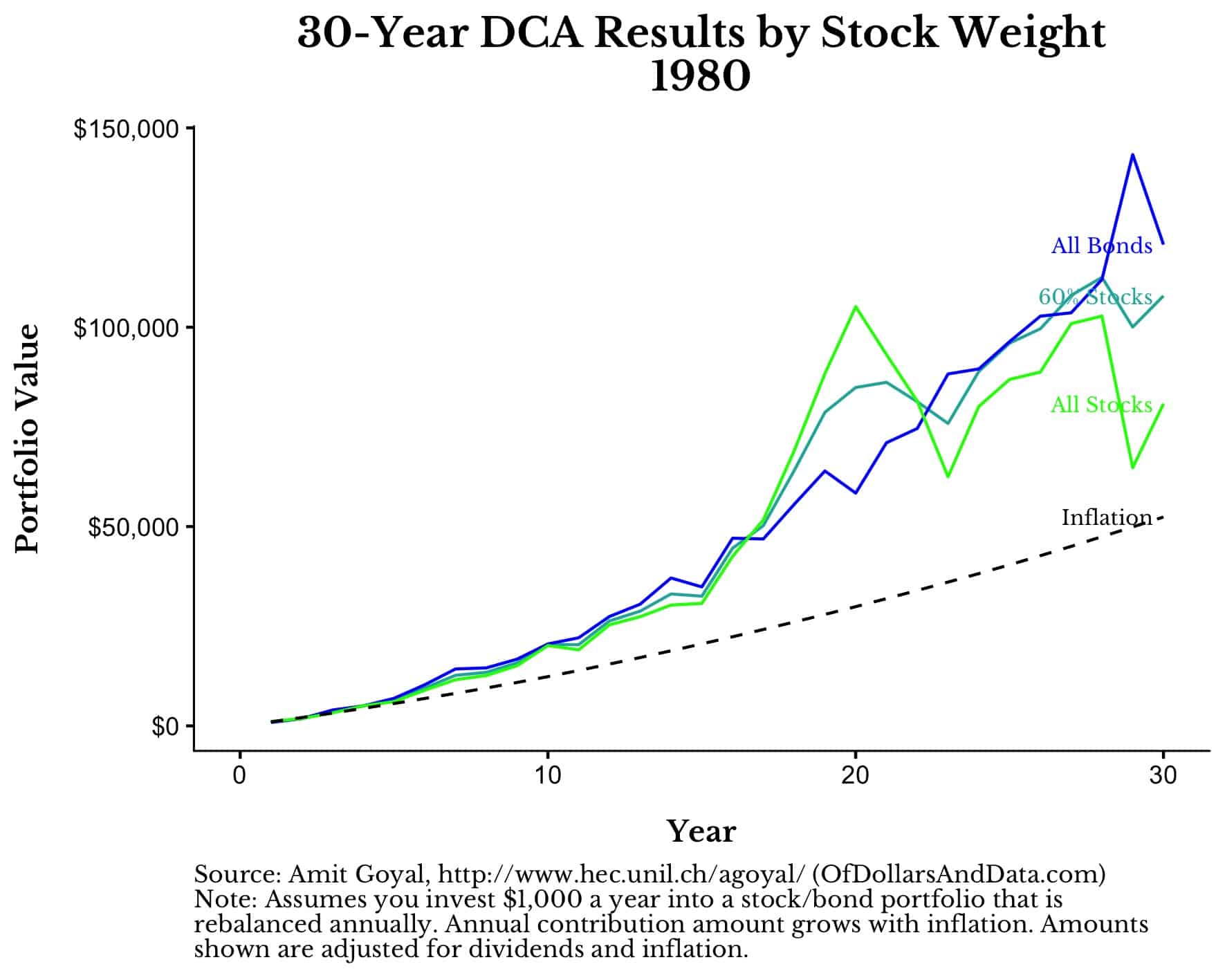 From this chart it’s easy to see the value added from investing in both U.S. stocks and bonds as the 60/40 portfolio outperformed an all U.S. stock portfolio over this time period.
However, if we were to turn the clock back 30 years prior and look at this same simulation from 1950 to 1980, the result would be quite different:
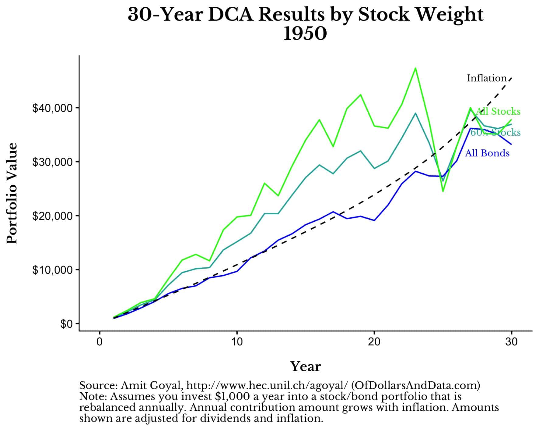
Over this time period, all of the portfolios (even the all U.S. stock portfolio) failed to keep up with inflation! It’s no wonder that Businessweek put out its infamous “The Death of Equities” issue in late 1979.
From these two charts alone we can see two completely different investor experiences. One is pro-investing and will espouse the greatness of the markets while the other looks at them with deep cynicism.
Yet, both cohorts of investors behaved in the exact same way! One of them just got luckier than the other.
Despite the differences in luck, what can we learn from this? If we look across all periods of market history, are there any common takeaways?
To answer this I ran the simulation above for every 30-year period from 1930 to 1985 [Note: In the graphic below please ignore the y-axis.
These amounts vary across time because of differences in inflation. What you should focus on instead is the relative performance of the various portfolios against inflation in each 30-year period]:
As you can see, during many of these 30-year time periods, bonds underperformed inflation. And while stocks almost always beat inflation by a sizable margin, there are several short time periods where this wasn’t true.
With U.S. bonds currently yielding less than 2.5% (before inflation) and many global bonds yields going negative, you might be wondering why you should own bonds at all?
If history is any guide, it is likely that the bond portion of your portfolio will not provide the same level of growth that it did for investors in the 1980s and 90s.
But, even despite this low-to-no real return in U.S. bonds, bonds still make sense in a portfolio because of how they perform when stocks fall.
If we look at the largest market crashes throughout history we can see that bonds are generally stable (or rise) when stocks get hammered:
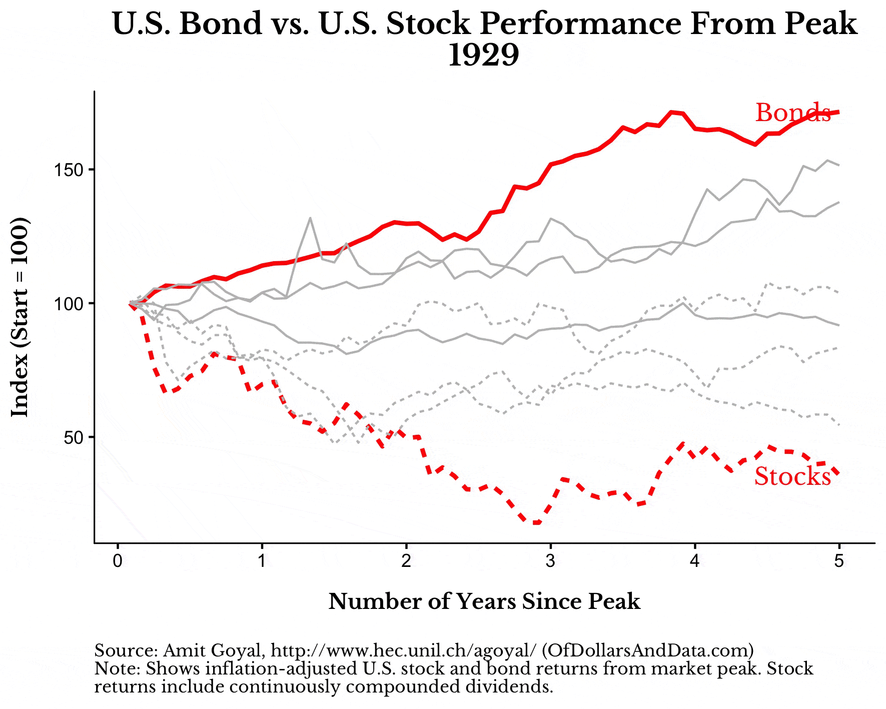
This is why we own bonds. Because the performance drag they create in the good times act as a life preserver for your portfolio in the bad times.
After reviewing the simulations above, there are a few conclusions that are reasonable to expect over your investment lifetime:
- Stocks will have half-decade to full decade periods where they underperform cash by a significant margin.
- Bonds will likely not provide much return for most of the time, but having them in a portfolio adds value when equities inevitably crash.
- You probably won’t buy all of your assets at once or sell them all at once. Successful investing is a marathon not a sprint.
Famine and Fortune
If you haven’t noticed from the plots above, the experience of a typical investor is heavily determined by what happens near the end of their investment timeline.
This is why dollar-cost averaging from 1970 to 2000 looked so great in the year 2000. But a few years after? Not so much.
The end of your investment timeline matters because this is typically when you have finished accumulating wealth, and, thus, have the most money at stake.
Formally this is known as sequence of return risk, and it explains why the decade you retire in will be more important than the decade you started investing in.
It also explains why you might experience a bumpy retirement because of a market crash despite making all the right investment decisions throughout your life. It’s not your fault. You did nothing wrong. It just happened.
That’s the nature of luck. Sometimes you will be down on it and sometimes you will be up on it. Famine and fortune go hand in hand. If anything, that’s the most realistic investment result of all. Thank you for reading!
If you liked this post, consider signing up for my newsletter.
This is post 149. Any code I have related to this post can be found here with the same numbering: https://github.com/nmaggiulli/of-dollars-and-data